No matter how many times we hear about it, the animation process always seems like an incomprehensibly big undertaking. Years and years of work go into creating a 90-minute tale like Pixar’s The Good Dinosaur. Additionally, there are certain elements in each film that have never been done before or that set them apart from any other animated movie.
We recently had the chance to talk to Harley Jessup, production designer of The Good Dinosaur, about how these vast animated worlds are created and brought to screen:
FanBoy: Congratulations on the feat of The Good Dinosaur — it was quite a breathtaking movie.
Harley Jessup: Oh, well thank you very much. I loved getting the chance to work on it. I feel like Pete Sohn did an amazing job on it.
FB: Can you tell us a little bit about what your role in the movie was?
HJ: As the production designer, I’m leading a team of character designers, set designers, sculptors, matte painters — I guess not matte painters on The Good Dinosaur — but environment designers to create the settings and the designs for the settings for the characters to this point.
FB: One thing that was impressive about The Good Dinosaur is you were able to meld a very realistic looking environment while still having characters that were likable and had that, not photo-realistic quality, but that quality that makes animation fun.
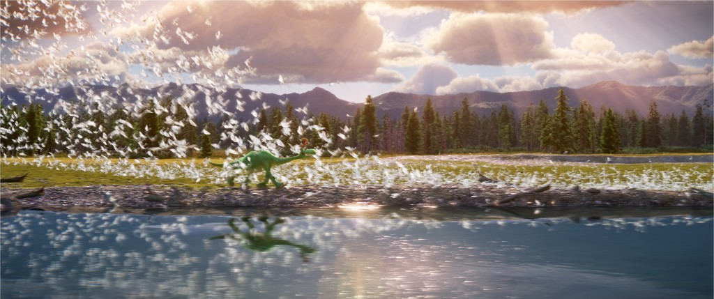
HJ: Well, that’s what we were hoping the audience would recognize. I know there’s a contrast between the design of the characters and the environment. That definitely was on purpose, but it also was an experiment that we were trying. I was very excited about how that turned out. Sort of counter-intuitive. But loved being able to see a brilliantly green Arlo on a mountain top two miles away. It made it so the scope of the film could be that much bigger. We were looking at David Lean films like Lawrence of Arabia, and Carroll Ballard films like Black Stallion for that kind of big scope, natural beauty in the background.
FB: I think it really worked because you have these cute characters trying to distinguish themselves from that breathtaking scope.
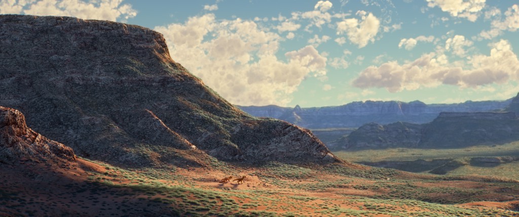
HJ: I should say, even the world, we weren’t going for a total photo-realistic look on it. We were calling it painterly realism or, trying to create an emotional landscape, if that ever makes sense. Where the environment is really reflecting the emotion of a particular scene. It really was very exciting to try to show that in the natural forms of the mountains, and the cliffs, and the quality of the river in the background whether it’s sparkling and classic or rushing and dangerous looking. That was the first time I’ve worked on such a big-scope film where nature was really the subject matter in the background. I’ve learned a lot from our lighting DP, Sharon Calahan, about designing with nature and simplifying things. Even though we do have millions of trees and rock formations and natural geysers and that kind of thing in the background, we were trying to compose the settings like a landscape painter would compose a painting always.
FB: I think you succeeded. Because this was so different, in my opinion, from a lot of what Pixar had done in the past, was it challenging to bring your designs to life technically? Did you have to work closely with the more technical side of the folks at Pixar to try to find ways to bring it to life for the first time?
HJ: Yeah, we really did. As you said, because we were venturing into something new. We’d never done a film set completely in the natural landscape. The only bit of architecture is the dinosaurs’ farm house. We knew we had to do the film in a different way. When we explored the idea of using the US geological survey maps as a really rough base for the landscapes, it made so many things possible. We realized in that moment, totally new technology has to be developed to fill that landscape, which is really just blurry, that it’s authentic in it’s overall form in a way that no person could design really. But to cover that with trees and rocks, we had to develop new technology to shade those millions of lodgepole pines and the salt rock formations in the background.
So we were trying a lot of new stuff. The tests took a long time at the beginning. When it sort of clicked into place and we knew we could do it, it was kind of breathtaking. The first test, when it finally bore fruit, was amazing. And we just went for it. We didn’t have much time to look back. So it was very exciting, very challenging at the same time, because we’re modifying those maps to create our hero action areas. So it was really a blend of hand-built sets in the foreground and procedural computer-generated US GS work in the background. We were touching really everything by hand, but it really helped us achieve that scope.
FB: Now, as we’ve talked to other folks involved in the production, they talked about how the film went through a very strong story evolution through its production. Did your designs really evolve as well, or did you pretty much stay true to where you originally started and just he story changed around it?
HJ: The context for the settings really changed. I was lucky that I was on the later team of the art department. So, I inherited really beautiful work that Daniel Lopez Munoz had created in his team. We used all of that as well as then creating a totally new set of environments for Arlo’s journey. So it was really a mixture. And I think that is what makes the look of The Good Dinosaur unique in certain ways. It’s like every Pixar film; the story is evolving and the design evolves on each one of the films. All of the films I’ve worked on have gone through major story change, it’s something that, being a production designer, it comes with the territory at Pixar, to roll with the changes.
FB: Is there any detail in the design work that audiences might not notice but that you’re very proud of?
HJ: Yes. I’m always proud of the quieter moments. We talking a lot about that giant scope. I really love, we call them the haiku moments of a lizard that skitters out from under a rock, and the raindrops falling on the leaves, the birds nestling in a nest. Those, I feel like, are totally Pete Sohn, the director’s, kind of moments. To mix that with the big adventure stuff is one of my favorite qualities of The Good Dinosaur. There’s something about a film about characters that are twenty and forty feet tall that’s wonderful. But I also loved appreciating the pine needles that we created on the forest floor, and moss on the side of a tree, and the little creatures in the forest that you realize, oh this whole environment is filled with wonderful, exotic, prehistoric creatures.
FB: In the brief little bio that they gave us, it says that you started work at Pixar in May of 1996 for Monsters Inc.? Could you just briefly give us a little bit of background on yourself and how you got involved at Pixar?
HJ: It was kind of a completely uncontrolled professional journey. I started out working on Sesame Street spots at our little animation studio where we made them with cutout paper. So that was my first real animation experience. And then I wound up working in visual effects at Industrial Light and Magic and doing work on a couple Lucas Film live action films. That led to doing the stop motion film James and the Giant Peach. Each of those career junctures, I learned something new, that has really helped me at Pixar. It was completely unplanned in certain ways, but I always was trying to work with the best people, the best studios that I could to get to work on the best projects. It’s like a dream having ended up at Pixar where I feel like their dedication to quality is so high.
FB: I agree with that. And I agree that The Good Dinosaur is an example of the strong quality that continues to come out of Pixar. Best of luck in your future endeavors, and to everyone at Pixar working on Finding Dory and everything beyond that.
HJ: Well, thanks! Laughing Place is one of my favorite websites. You guys to great work there.


