 As a fan of Disney history, I’m always intrigued by the way modern artists draw influence and inspiration from legends of the past. When a presentation was added to the schedule at the Walt Disney Family Museum called “Eyvind Earle: His Influences on Disney Animation Then and Now,” I knew this was going to be something special. On Saturday, November 4th, I joined a theater full of fans and artists to give my undivided attention and learn more about how Eyvind Earle’s esthetic is still being applied to Disney animated projects today.
The presentation was given by Mike Giaimo, a Production Designer at Walt Disney Animation Studios who leant his talents to Pocahontas and most recently, Frozen, both of which feature elements inspired by Earle. He started by examining how his childhood fascination with colors and shapes lead to him becoming fixated on Eyvind Earle’s designs after seeing Sleeping Beauty. As he grew into the artist he would become, Giaimo studied Earle. In his own words, “To know the artwork, you have to know the artist.”
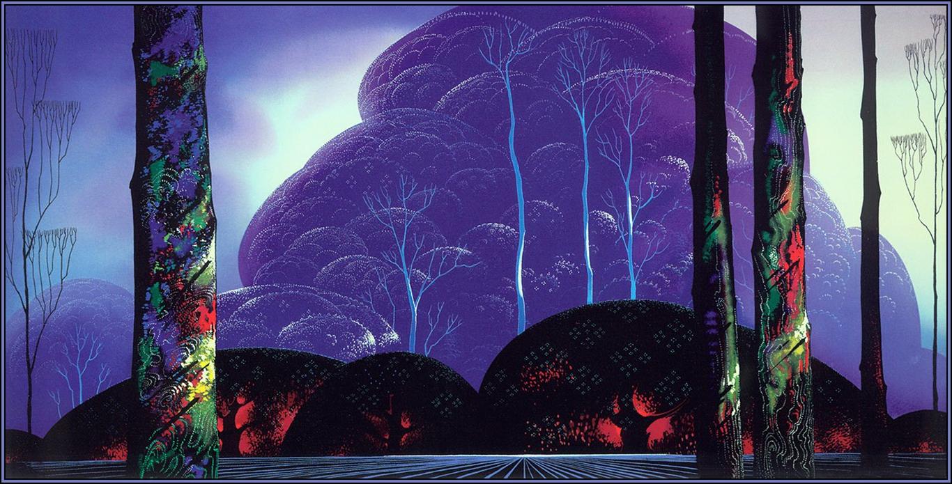
“Purple Sunset” by Eyvind Earle
We were treated to a CliffsNotes version of Eyvind Earle’s life, which was full of sadness and heartache. After contracting polio and losing a sibling to the illness at a young age, Earle suffered paralysis on one side of his face, which is believed to have lead to his artwork’s trademark symmetry. His father was an oppressive artist, disallowing young Eyvind to play with peers and instead forcing him to paint a picture each day to hone his craft.
“When you look at his work, you can sense a feeling of peace and solitude,” Giaimo explained as he revealed how the majority of Earle’s works are environments with very few people. Even when humans are present, they blend in and are not the main focal point. “There’s a patina of melancholy often over his work. It’s elegant and peaceful, but not joyful.”
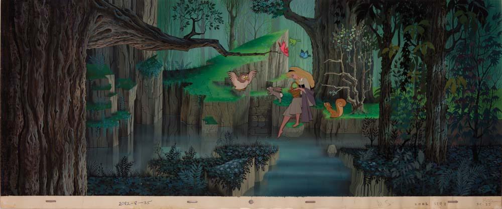
Original animation cel and background from “Sleeping Beauty.” Source: icollector.com
Speaking specifically about Sleeping Beauty, Giaimo discussed how Walt Disney was so enamored with Earle’s work where every detail was heightened, yet color was used to draw the eye where it needed to go. He took great effort to ensure that Earle’s vision ended up on the screen and wasn’t diluted between concept art and the final product. “It was the most epic feature film that Walt Disney made,” Giaimo continued. Marc Davis was another fan of Earle’s esthetic and he assisted his vision by designing the characters with strong shapes, silhouettes, and vertical lines.
In Eyvind Earle paintings, there’s an emphasis on horizontal and vertical lines. In Sleeping Beauty, his background paintings contrast warm and cool colors, often harmoniously blending together in the same frame. Jewel-like colors made certain elements of his work sparkle and shine. He also made excellent use of black, which can often become a hole or look flat in art. Almost every character in the film has at least a little bit of black on their costume.
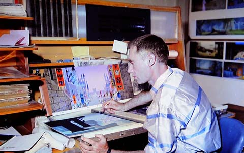
Eyvind Earle working on “Sleeping Beauty” backgrounds. Source: Cartoon Brew
As an example of Earle’s brilliance with color, Giaimo walked us through the “I Wonder” segment of the film. Briar Rose’s dress is all earth tones, she completely assimilates into the forest around her. When Prince Phillip enters the forest, he wears a red cloak, which stands out as a foreign color against the scenery, symbolizing that he doesn’t belong there. But by the end of the song when he meets Briar Rose, he, too, is dressed entirely in earth tones, being welcomed into her world. This subtle choice is something you subconsciously understand, but rarely would a viewer overtly notice this level of symbolism.
When Mike Giaimo was invited to be the Art Director on Pocahontas in 1992, he wanted the film to stand apart from The Lion King, which was in production and drawing from more naturalistic environments. Since the story was taking so many artistic liberties with history, he wanted the art direction to also take liberties with nature, what he called “A decorative world as a counterpoint to the realism of the story.”
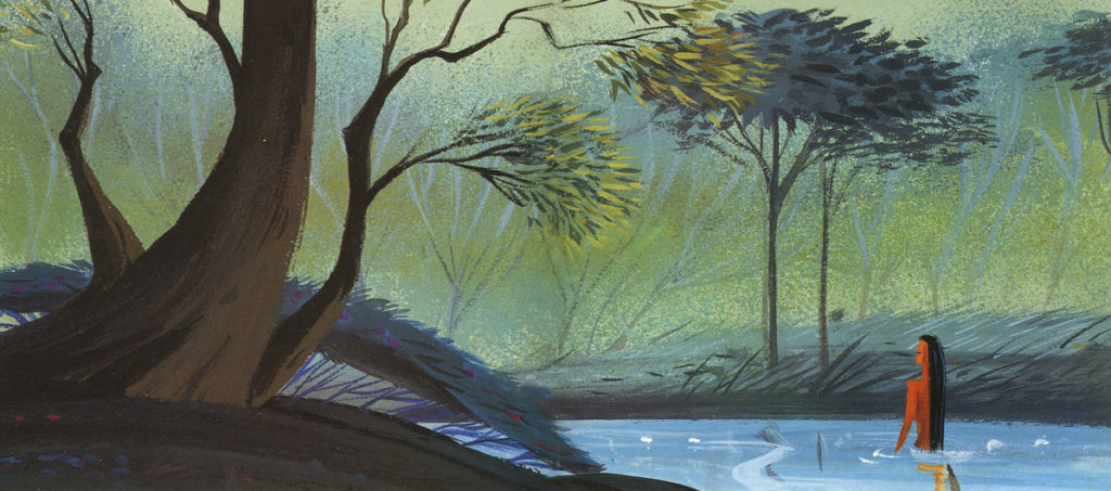
“Pocahontas” Concept Art by Mike Giaimo Source: “The Art of Pocahontas”
Like the work of Eyvind Earle, the world of Pocahontas is full of peaceful horizontal and vertical lines. Character designs are angular and contain linear shapes. The characters and world are peppered with jewel-like colors and warm and cool palettes. And like Prince Phillip’s red cape, Governor Ratcliffe arrives into Pocahontas’ world wearing foreign colors like fuchsia and purple. Black was used somewhere on nearly every character in the film, just like in Sleeping Beauty.
When Giaimo started work on “The Snow Queen,” his intentions were to approach the project with curves as the main design element. It was originally planned as a hand-drawn feature full of whimsy, but then the story changed drastically. The original treatment featured the queen as a campy villain, with Better Midler in mind for the role, and the story took place in a tiny village called “Mistletoe” which didn’t even have a castle. Anna and Kristoff were citizens, but had no relation to the queen, and a matchmaker had paired the two together before their adventure began.
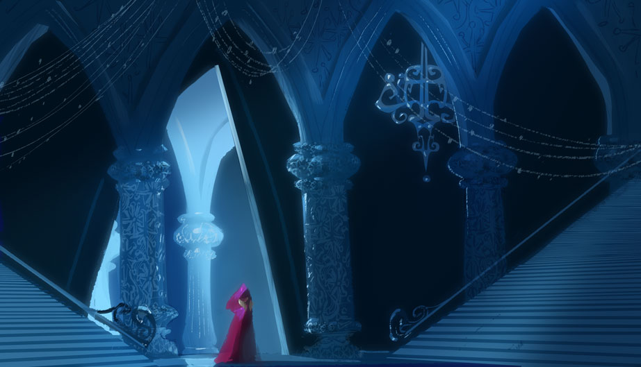
“Frozen” concept art by Victoria Ying Source: Gizmodo io9
Now that Frozen was going to be a different kind of film, Giaimo found himself once again finding inspiration in the work of Eyvind Earle to give the story the elegance it now required. As he began to study Northern European architecture, he discovered that his favorite design elements came from Norway. Taking traditional Norwegian architecture elements, he began to stretch them vertically to create a world that looked inspired by both the people of Norway and Eyvind Earle.
Creating the world of Frozen in the computer also afforded the team the opportunity to increase the Earle esthetic. In addition to highly detailed patterns throughout Arendelle’s castle, the character’s costumes are the most detailed ever designed for a computer animated film. Like Eyvind Earle, the team controlled color values in the computer to draw your eye where it needs to be on screen despite the frequent presence of busy patterns. The film’s design also stresses the character’s as iconography, with Elsa always appearing beautiful and elusive while Anna is saturated and dynamic.

Looking ahead, Mike Giaimo continues to work on Frozen projects with Olaf’s Frozen Adventure releasing this Thanksgiving and Frozen 2 in active production. For the new holiday special, Giaimo designed two new costumes for Anna and Elsa in addition to creating the decorations that allow Arendelle to celebrate Christmas. You won’t find red and green design elements, but instead are treated to dusty blues and grays. Elsa’s cape features her ice tree design, which becomes a touching part of the special. Anna’s costume contains elements of the berry wreaths that decorate the kingdom and also features bells and goats, both of which are a big part of the holiday season in Norway. The short also gave the team the opportunity to work with romantic snow, because the snow in the feature film was always made to feel threatening or isolating.
If you’re planning a trip to the Bay Area, I highly recommend spending a few hours at the Walt Disney Family Museum in the beautiful Prosidio of San Francisco. In addition to the museum and a rotation of special galleries, they often have classic Disney film screenings on their calendar and the occasional special guest lecture, like the one I just recapped. It’s not only a great way to learn more about Walt Disney and the artists he inspired, but also to mingle with some fellow fans and potentially meet some artists following in the tradition of legends like Eyvind Earle. I couldn’t help but notice quite a few Pixar artists in the crowd that day.
