Interview with Star Wars Author Tony DiTerlizzi
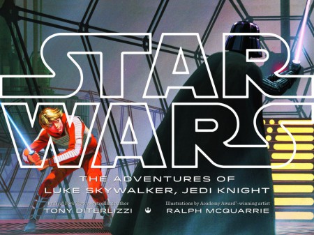
Last week I had the pleasure of speaking with New York Times bestselling author Tony DiTerlizzi about the upcoming release of his newest book: Star Wars - The Adventures of Luke Skywalker, Jedi Knight
"The classic tale of good versus evil set in a galaxy far, far away, quickly became a cultural phenomenon during its time, inspiring a generation of story lovers and storytellers. Now, the original trilogy of Star Wars shines anew with the vibrant concept art of Ralph McQuarrie, the legendary conceptual designer behind the original trilogy.
Collected in a picture book for the first time, McQuarrie's art is paired with captivating text by author Tony DiTerlizzi, a winning combination that will delight Star Wars fans old and new and delight generations of readers to come."
So how did this book come about?
They contacted me with the idea of telling the story of Star Wars by pairing my writing with Ralph McQuarrie's concept art for the original three films. They explained that it would be not unlike the Mary Blair books that were done a few years back where they had noted children's book authors paired with Mary's concept art for Alice, Peter Pan, and Cinderella. Of course I was like, Yeah I'll do it...here's my house, here's my first born! I had expected to get 40 illustrations, but it was over 200 in the PDF they sent me, I mean it just went on and on. It was an unbelievable deal to see all that stuff. One of the first things I said when I called them back was that they seriously needed to do an art of book that features all the work he did, it was a tremendous amount of work.
Was there material that you hadn't seen anywhere before?
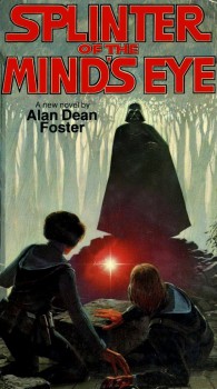
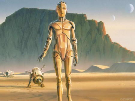
I've seen a lot of the well known stuff, but there was stuff there that I had never seen. I tried to include a mix of the iconic imagery like say the Metropolis C3PO and R2 when they land on Tatooine mixed with the lesser seen images. For instance, there's a shot he painted of a hanger in the Death Star with Darth Vader getting into his Tie Fighter. I'd never seen it before, and I was like weve got to put that in there, you don't even see that in the movie! Later on I understood that some of the artwork was done for packaging or audio books. It was done for supplementary projects not just for the film. I had forgotten that he'd done the cover for Splinter of the Minds Eye, the first spin off novelization, so we put that in the book as well.
The interesting thing was, for as much as he painted, there was a lot that he didnt paint. This actually helped me a lot because its hard enough to take such an epic story and truncate it down to 64 pages...all three films. Thats like taking The Lord of the Rings and saying "We want to make a 64 page book of Lord of the Rings, can it be done?" and you're like, well, yes, it CAN be done. So as a picture book author, you look to see what the symbiotic relationship is between words and pictures. In this case I had a lot of pictures, but could get no more done, what we had is what we had. So then you look and say that this is a great shot of this, but there's no paintings of Obi Wan facing Darth Vader, there's no painting of the Death Star exploding, there's really no paintings of Princess Leia. So then you knew where the words would have to do some of the heavy lifting. Also because the way Ralph worked, I think we was mostly tasked with vistas. He's designing characters and ships, theres no question about it, but he's also painting a lot of architecture, you know, this is what cloud city looks like, here's Jabbas palace. So a lot of the figures tend to be small. That was a little hard for me because I really felt with the way I approach picture books, its all about the character and your connectivity to that character. We care about Max before he goes off to see the Wild Things, you know what I mean? So the solution we found was that there were just so many sketches he had done, we were able to integrate them into the book as well. I was able to have Princess Leia be present via a beautiful sketch he did of her from A New Hope along with Luke, Han, Chewie, and all the other characters that we love. So it was like a puzzle, it was like someone took three jigsaw puzzles, poured them all over the table and said "You dont have to use every piece, but make a new picture."
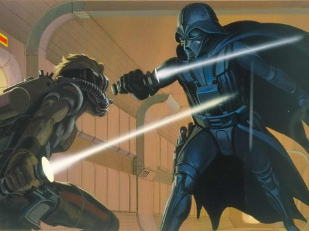
There is that one great image of Vader facing off against the character that would eventually become Luke Skywalker, but that character was named Starkiller, and doesnt look anything like Luke.
And again, another great iconic image that shows the menace of Vader. He never really paints another image of Vader that is that amazing and menacing. So you're like, I have to get this in the book...but how? I ended up using it for the passage where the narrator explains that it was known throughout the galaxy that Emperor Palpatine and Darth Vader destroyed all of the Jedi Knights. So then it just becomes an illustration of order 66 from the prequels. So Starkiller becomes of no one in particular, it's just a generic Jedi Knight that Darth's taking out. So like I said, it's like a puzzle. How do I get this in here and make it work so that it doesnt go at loggerheads with what we know is the cannon in the films, but also serves the picture book and what it's got to do. We did put an introduction in the front of the book that just said that it was an ongoing dialogue between George and Ralph and therefore there were constant design changes. I asked them very early on "Do you guys want to photoshop and tweak the art to make it look like what's in the film?" They said "No" and I was like, great thats awesome! This is the art I grew up with and I love that it evolved as the story evolved. I love that.
You had 64 pages to work with, how much of that artwork ended up in the book?
I wanted to cram it with as much of Ralph's art as possible. So the way I designed, because you have to tell so much story, I'd take a dominating image, it would be full page or spanning across the entire spread, and then use supplementary smaller images to support what's going on in that scene.
For instance, on the two page spread with C3PO and R2D2 landing on Tatooine there are also two smaller images. One of the Sand Crawler, and one of the Jawas scavenging. just to show where they went, and what they did. It definately doesnt have just 64 pieces of art. I'm going to go ahead and guess that its got close to 100 pieces of artwork in it. I never stopped and tabulated it...but it's a lot. I definitely tried to get as much artwork of his in there as possible so that your eyes are just moving the whole time. That's what's cool with the giant trend size, as an adult you're like "Oh this is a nice size book." if you're a kid and its that big, it's all you see. When you're that small and you open up a book that's 2 feet wide...that's a lot of book! That's what I wanted, I wanted to really be able to disappear into this world that I loved so much as a kid. I came back to them when lucasfilm asked me to do this, I asked "Do you want this book for just kids, or do you want it for guys my age?" I turned 45 this year. They said, "Well we want it for both." and I said, "Okay its a little tricky, but I think it can be done." Ralph's art is beautiful, but in some ways its very different than what's going on in picture books right now. It's a very different climate. Its not to say that kids wont totally glom onto it and love it, but it's a little trickier right now. There's tastes and styles that go in and out of kids books.
How did you approach the task of actually writing the story?
I hadn't watched the films in a couple years, so I wanted to just conjure up everything I remembered about these films. The details that stuck with me through childhood and repeated watchings as a parent, the important stuff. The other thing I wanted to do, was to think back to 1977 and what my first memories of Star Wars were. Could I get some of that into this book, could I make it feel the way we felt when we were kids seeing all this for the first time. Ive often wondered why Star Wars had such a tremendous impact. I cant think of a lot of films that did what Star Wars managed to do. Star Wars came out in theaters May of '77, the VHS, which is how most people would have seen it at home, came out in the mid 80's. I know thats when my parents got it for us kids. So for almost 10 years you can't watch Star Wars. You can play Star Wars, you can pretend Star Wars, but it primarily lives in your memory of watching the film, playing with these toys, looking at these art books. You couldn't just click a button and watch it over and over again. With the early Disney films it was the same thing. Right up until home entertainment really took off, I remember how my mom would talk about Fantasia, I couldnt wait to see Fantasia. When I played Star Wars, I dont know about you, but it was always pew pew, crash, slam, ahhhhhh! I am your father...you know all that stuff. So I put all that in the book in giant bold letters, all those call outs, lots of onamonapia, lots of sound effects, and you have to say them loud when you're reading it.
You hit the nail on the head, most kids wont remember all the little tiny details, its those big moments that they're going to recreate while playing Star Wars.
For us older kids, there's kind of a nostalgia in it where you're kind of getting to experience it for the first time. Hopefully getting those same kinds of feelings you had when you were a kid sitting in a dark theatre experiencing Star Wars for the first time.
Was there any artwork that was just so far off of what ended up in the film that you just couldn't make it work in the book?
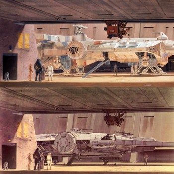
There were actually images that he had painted over. The only reason we didnt use some of those was because the only documentation of the original paintings were photographs that George probably had shot and then archived. There are three that I can remember off the top of my head. There was one in Docking Bay 94, and it's a very early version of the Millennium Falcon. He must have gone in and painted over it and redid it. It's one of the early Falcon designs that looks a lot like Leia's Blockade Runner.
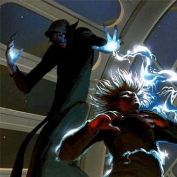
Then there was a shot in Yavin where they're all boarding their ships and there's a big Y-Wing Fighter in the foreground. It's a very different Y-Wing Fighter, its an early prototypical version, its got big B-52 Bomber bubble turrets on it, so it was cool. At some point Ralph went back and repainted the Y-Wing to look like it does in the finished film. Then there was...this one I really wanted to get in, but again they were like "We can use this old photo, or we can use the scan of the finished painting." It was Emperor Palpatine at the end when hes zapping Luke with the lightening. There was an earlier, almost grim reaper Palpatine that's just awesome looking. It's really different, its very cartoony though, its very animated.
Clearly there had been no concepting, I think its probably George just saying "He looks like this..." Ralph doing his take on it, and then later repainting the face to make it look more like the character in the film. We had it in the book when we were first laying the book out, but some of these images, Ralph worked pretty small, he didnt paint real big, at least for these particular concept pieces he didn't. Some paintings were massive. Some of them we had to enlarge for the book because the book is 9 by 12 and when the book is open, you've got a two foot book. I really insisted that we try not to use photographs on anything that we had to enlarge. When you blow something up that much the artwork tends to get grainy. On that one we ended up using a physical scan of the artwork. That one was a little tough to see go because it was such a cool looking Emperor. It was very simple, hes not as pruny and wrinkly...you know what he looked like? He looked like Voldemort, like a cartoony animated version of Voldemort, it was cool.
Anything odd that you managed to make work?
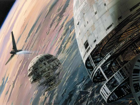
There was an entirely new piece of artwork that I had never ever seen before. There's an illustration where there's two Death Stars next to each other. I guess in Jedi there were two Death Stars, I dont know if that was an early concept? I think the idea was that there was an unfinished death star like the one we see in the film, and then there was a fully completed death star hidden.
We ended up using the image. We just very strategically put the box of text right over the other one so you see this big giant unfinished Death Star and an Imperial Shuttle. Two Death Stars? That was like What?!? I had no idea.
That's a pretty major script change. Did you discover anything else like that?
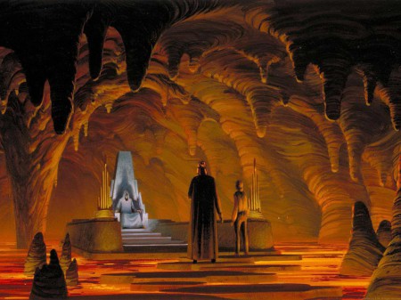
Yeah, I'm guessing that the final showdown with Luke, the Emperor, and Darth was not intended to be on the Death Star, but was supposed to be on Coruscant somewhere. There were a whole bunch of illustrations of Darth Vader leading Luke around coruscant, and then they go into this temple, and then into like the bowels of the temple, and the Emperor is just sitting on a throne on a rock floating in the middle of a big pool of lava.
You could see where they'd plucked pieces for the prequels. I mean the Coruscant stuff is really close to what we ended up seeing on screen. George must have been happy with what Ralph had done in the 70s and 80s on it, because in tone, color, and the giant epic sized buildings...very similar.
Final thoughts?
You know what I think? It's almost hard to think of Star Wars now without thinking of toys, and legos, and costumes, and theme park rides, and everything else. It's hard to think of it at a point when it was just words on a page and paintings. That is the moment that I really tried to hone in on. To rewind back to that time when Star Wars wasn't a phenominon yet and it was just stories about a farm boy who became the greatest knight in the galaxy. That is what a picture book is, its about words and pictures harmonizing and working together, and that was where I had to go with this.


