D23 Expo: Welcome to Zootopia
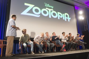
 One of the seemingly low-key presentations at the 2015 D23 Expo was called "Welcome to Zootopia," held in the smallest of the three main venues, Stage 28. And prior to the animation presentation on Friday, I don't think anybody expected it to be a full theater. But after the hilarious tease during John Lassiter's Hall D23 show, it quickly became a must-see with Stage Passes gone well before it began and an overflow queue that couldn't accommodate everybody.
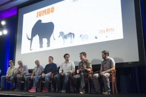
Darrin Butters, a charismatic animator, was the host and introduced directors Byron Howard and Rich Moore, producer Clark Spencer, writer and co-director Jared Bush, writer Phil Johnston, production designer Dave Goetz and head of animation Renato Dos Anjos. "Most people only have one 'Anjos," but Renato has dos 'Anjos'", Butters exclaimed with glee as he set the tone for this comedic discussion. When you added up their credits, most of them played key roles behind such recent hits as Wreck-It-Ralph, Tangled and Bolt.
The discussion began with their research trips, starting with a stop at Walt Disney World at the suggestion of John Lasseter. While there, the crew experienced the Wild Africa Trek experience at Disney's Animal Kingdom, spent some time on the savanna at Animal Kingdom Lodge and got to be up-close for a snake's cyst removal. But realizing that they needed to see these animals in their natural habitat, their next stop was a "Life changing" trip to Kenya.
It turns out that one of the animator's, Nathan Warner, is hated by almost all animals. Anecdotes included a seven-foot ostrich named Mabel biting him on the nose, Ziggy the zebra biting his groin, and a cheetah raised by humans and completely friendly who decided to scratch Nathan's back, and not in the helpful way. And that's how he received the nickname "Nate-the-Bait." "The movie is dedicated to him," joked one of the writers as the team shared a good laugh.
A scientific chart was created to help keep size comparisons between the animals consistent, since there are critters as small as mice and as tall as giraffes. The team had to figure out how all of these animals would live harmoniously in a metropolitan city and created some brilliant inventions. To cross the street, mice enter a glass tube underground with a moving sidewalk while larger animals cross the way humans do. Hotels have one large bed with slide out drawers in an array of sizes for smaller animals. Magazines are available in multiple sizes too, with the largest periodicals up top while the tiniest ones are on ground level. Even public transportation had to be redesigned, with international auto designer J. Mays creating new vehicles for the film.
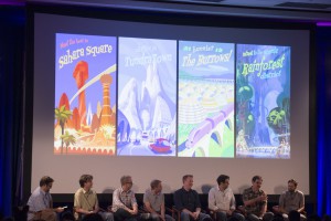
The city of Zootopia is split up into different neighborhoods designed to appeal to animals ancestral habitats. Tundra Town is the arctic section of the city, which is kept cold by a giant wall of air conditioners and promises a 3:00 blizzard every day. On the other side of the wall is Sahara Square, a desert climate kept hot by the exhaust from the same machines that cool Tundra Town. Rainforest District is another artificial climate while mice live in Little Rodentia and bunnies live in The Burrows, where the population sign is constantly increasing.
 The team did a lot of animal movement studies, with test animation to depict how these animals would look if they were walking on two legs instead of four. Many of these tests were redone after the Kenya trip and they presented a hilarious look at how camels walk in the film compared to real life, with their lips and humps bouncing at every step in both realities. They also had to change the roles animals play. Gnus (wildebeast - pronounced like "ga-new") for example were originally depicted as business executives in suits. But after discovering that gnus are incredibly dumb, they transformed them into deadbeats. One concept art piece showed a gnu wearing a shirt that said "I'm with Gnupid." And since gnus travel in herds, when one crosses the street they all cross the street.
Throughout the presentation, they shared many unfinished clips and test animation. Some of them repeated, such as the hilariously sexy tiger dancing his way into your late night thoughts, the elephant ice cream parlor, and everyone's favorite DMV scene. In Zootopia, the Department of Mammal Vehicles is operated entirely by sloths. It's possibly the funniest piece of animation I've ever seen in my life, from any studio, and it was just as funny the second time around, if not more so. And to add icing to the cake of seeing it twice, one of the directors mentioned that host Darrin Butters animated that sequence and the audience went wild with applause for him.
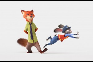 The theme of the film is "Bias." Judy Hopp's character journey is to prove that she can be more than who society expects her to be simply because she is a bunny. Her antagonist, Nick Wild, is a fox who represents society's view that she can't rise above who she was born to be. For such a comedic animated film, the message is not only deep, but increasingly relevant today. The filmmakers hope that it will open doors for people to start talking about these issues, especially with children. They promise that the message won't be preachy, but because they're using animals they can make these kinds of statements without offending any group of people because there's really no comparison.
The presentation continued with more clips as they basically told us the story without the climax. Another amazing scene involved a chase through Little Rodentia where Judy and the weasel she was pursuing suddenly became giants. The story team and animators seem to have explored every possible scenario that could happen in moments like these and the choices for the film are fantastic.
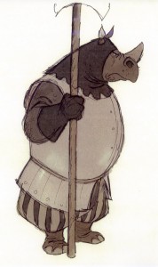 During the brief Q&A, someone asked if we will see any cameos from other Disney animated animals. They said "Maybe... it's a big city" (wink, wink). And stylistically speaking, they were inspired by the work of Milt Kahl and consider the characters to fit the "Disney DNA," specifically saying that the rhinos should feel related to the ones from Bedknobs and Broomsticks.
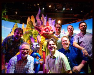
While the presentation was over and there wasn't a takeaway gift, Walt Disney Animation Studios did have an adorable display on the show floor to help advertise the film. Guests could get their picture taken with three-dimensional figures of Judy Hopp and Nick Wilde with the Zootopia skyline in the background. And while I missed this amazing detail, kids short enough to see through the windows may have noticed a hamster working out on his wheel inside one of the buildings. Incredible! The takeaway is that Zootopia is going to be hilarious and heartwarming, a modern classic relevant for the time and rooted in Disney history. Can it be March now?

