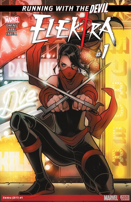
Comic Review: “Elektra #1”
The world is a tough place, and for an assassin who’s hiding, where do you go to disappear? Las Vegas of course. Continuing with the Running with the Devil series, readers now get the chance to see where Elektra went to hide from her past.
Elektra has disguised herself to blend in. The Las Vegas she is hiding in is not a kid friendly family entertainment resort destination. The casino that she has come to is a catch all for some dangerous people. It looks beautiful, and artist Juan Cabal has created what looks like a fun and active casino, that has some dark tones when you look closely. Hand to hand combat, and the extortion of the high rollers are just some of the perils waiting beyond the gaming tables.
She may be in hiding, but like a true hero, Elektra drops her disguise to help a terrorized bartender. Donning her famous red outfit, Elektra goes on the hunt, and her assault is not missed. Elektra can’t hide anymore.
My Opinion:
I knew little about the character Elektra before reading Elektra #1. All I knew was what I saw in the Ben Affleck movie and the Jennifer Garner spinoff movie. Based on the movies I saw, Elektra didn’t get the respect she deserved in either cinematic treatment.
Starting the comic in Vegas is nothing special. It seems like the evil casinos and gangsters have been the backdrop for multiple stories, comic, movies and television. Elektra for some reason has headed to the city of sin, in order to hide from her sins? I guess when you are looking to blend in, why not hide in a place where other sinners go.
Having no real background knowledge of her, I liked what writer Matt Owens did. He told a story about Elektra while barely using Elektra. She’s there, in the background, occasionally showing her face. It’s only at the end, that she come out of hiding for the mother of all beat downs on a large number of bad guys in the casino.
Juan Cabal does a great job in setting up the scenery for the comic. In most cases the dialogue would inspire the images for many comics. But it seems like Cabal’s drawings are the main focus while the dialogue is the supporting partner. The opening panels for the comic are beautifully designed to help start the Elektra saga like a movie. Rather than seeing a comic, the artwork acts like a tracking shot from the movies. We start at the first panel and just seem to glide over the multiple images of what is happening at this casino. I especially loved the little bits added to give depth to the scenes in the comic. Having the champagne labeled as tres expensive made me laugh, but at the same time, told me the people that come to this casino are high rollers.
I liked Elektra #1. I recommend it, and I want to see Elektra kick more butt.


