SIGGRAPH 2022 Reveals 2D Effects Created By 3D Artists in Pixar’s “Turning Red”
While Lightyear may have been the latest release from Pixar Animation Studios, you can’t take a film that is heavily inspired by 2D animation and anime that was animated in 3D and not talk about the technological hurdles and fascinating tricks that the crew behind Turning Red used in their movie. Luckily, SIGGRAPH 2022 provided the perfect forum to share some fun tidbits about Mei Lin’s story.
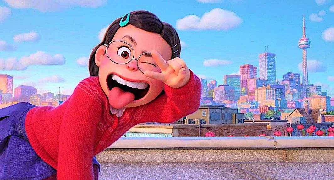
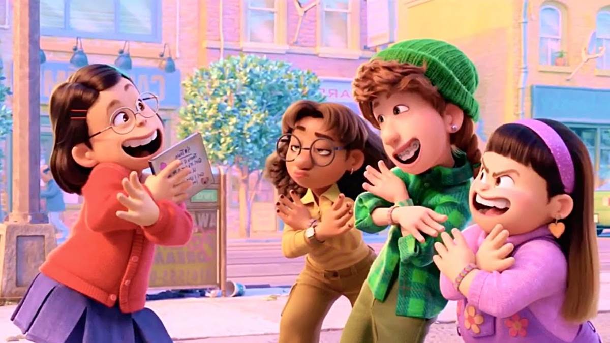
We previously learned about the film's “Chunky Cute" aesthetic during a virtual panel as part of the VIEW conference, and you can find out more about that here. This morning, we also heard that Director Domee Shi gave another phrase for the team to work with as a visual goal: “Teenage Fever Dream." Today at SIGGRAPH, we learned how those styles were incorporated on the technical side of the process, from the camera work, the simulations, and how the food shown in the film was the only thing to look photorealistic, but also incorporating the chunky cute style - simply by pooling colors. Color pooling was adapted throughout the film in very subtle ways. For example, where Soul might have a brick wall that looks super realistic, that brick wall idea in Turning Red will have a realistic, yet still fantastical or whimsical look. Take a look at the two below:
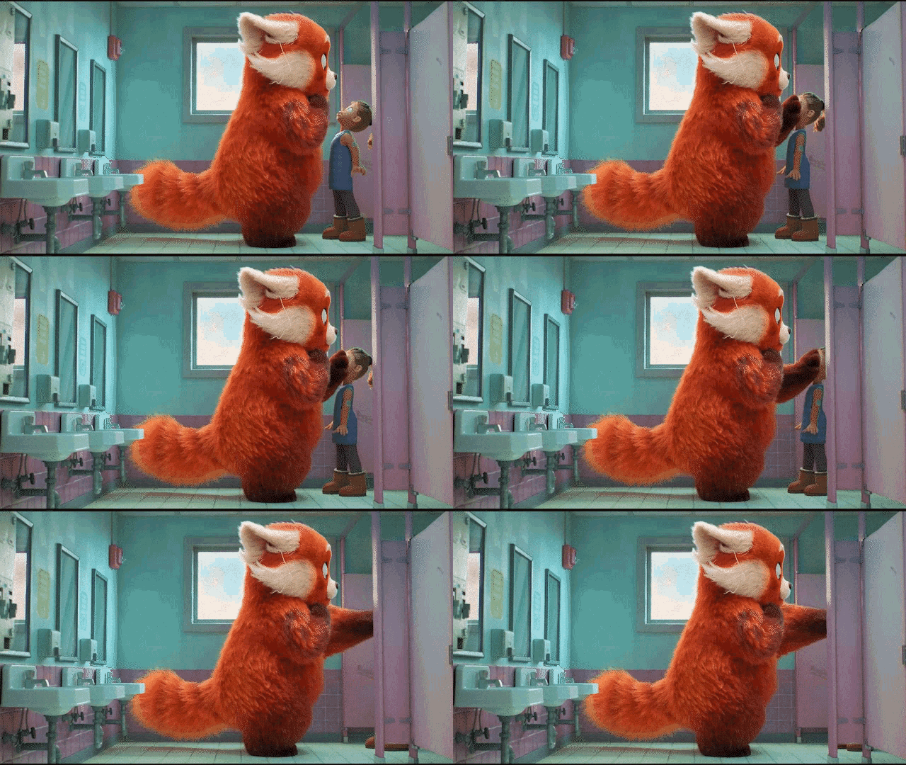
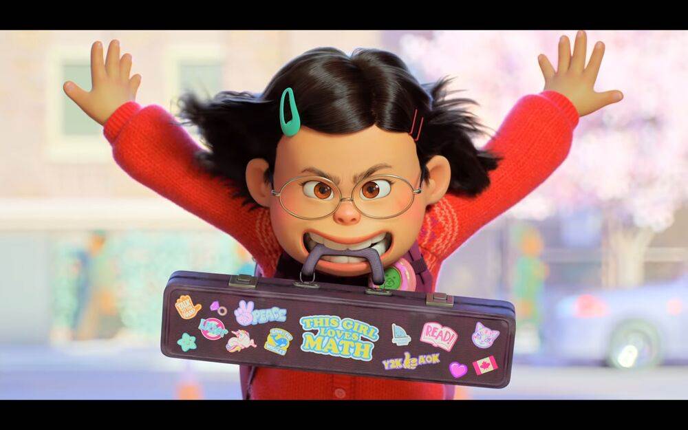
The panel explained that Turning Red was different in many ways from standard Pixar fare, but from the technical standpoint, to take decades worth of real world systems that have already been built into the studio’s programming architecture and break away wildly with a 2D-Inspired style proved difficult but enjoyable. And while systems needed to be adjusted, Artists themselves needed to adjust as well. Adopting more isolated movements in a 2D Fashion proved difficult for some animators who try to animate as many moving parts as they can. We were treated to around 5 different tests of the scene where Mei Lin is caught in panda form in the school’s bathroom (that tragically I cannot show here) where the animator responsible animated the whole body moving and couldn’t quite break away from animating a spinal turn or a leg pivot and only isolate the movement of Mei Lin’s arm. Finally, they got it right - to great comedic effect.
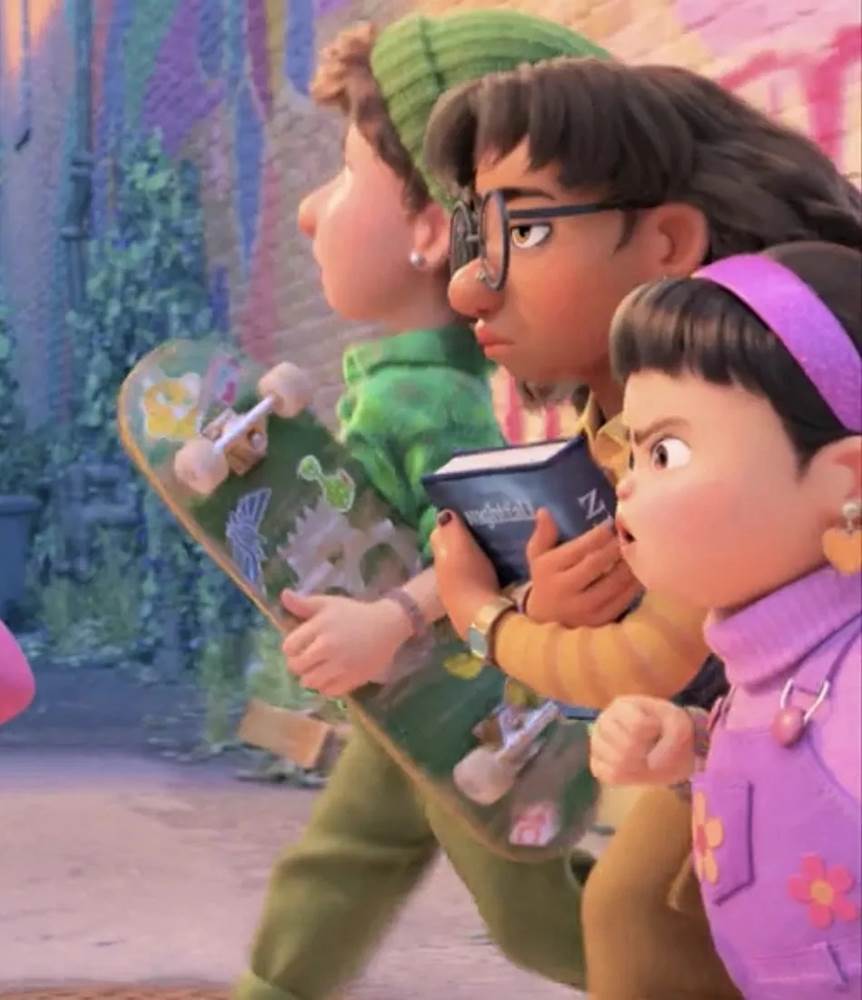
They showed a montage of different scenes where you can see how important isolated movement was in the film, so I suggest watching Turning Red again with that in mind and you’ll notice it a lot more. They also elaborated on more of the 2D inspirations, including cycles. Think back to Mickey Mouse in Steamboat Willie, where he is at the wheel of his ship and his hips move back in forth. In 2D Animation, that’s let's say 10 drawings that are shot and then looped a few times. In scenes in Turning Red, like when Mei and her friends are running down the street, their animation is given that same cycle treatment, so their legs hitting the ground are exactly the same as though they were drawings that were repeated a few times.
Another 2D takeaway (and I don’t think I noticed this until it was pointed out) - think of that same running scene. Throughout the movie, we never see two eyes in a side profile. The team showed off tests where two eyes were seen, as is done in other more traditional Pixar fare, and it seemed off. All side profiles in the film feature one eye.
Also helping give a 2D look to a 3D film - window glare. 2D style graphic window streaks were applied to nearly every piece of glass in the film. They can be seen in windows throughout the film, in picture frames, and even in the microwave of the kitchen scene. New formulas had to be written into the shaders used on the movie so that they can be easily applied and not have to laboriously be done one by one. In the picture below, look at the windows in the background. They have a flat styling with the diagonal window streaks common in comic strips and hand-drawn animation, but remember, all this was built in a 3D virtual realm.
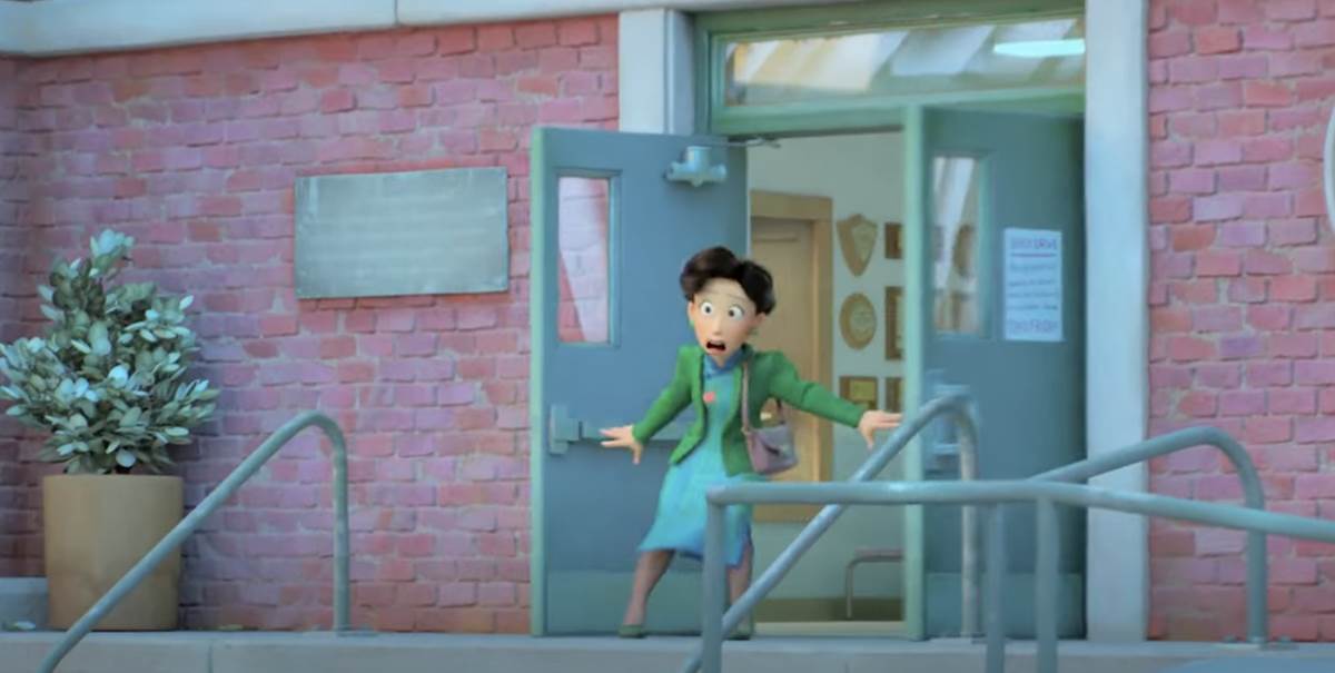
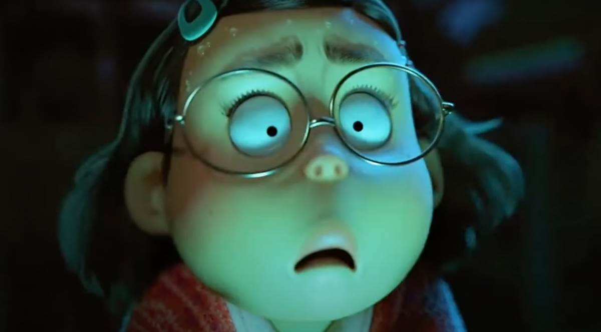
We also got to learn more about the simulation software and some of their amazing skills they used to add subtlety to the film. Elaborating on how the character’s hair changes throughout the movie to reflect their emotion (and not just the changing of color), we got to see the brilliant nuances that are seen in only the hair of Mei Lin. Take a look. In a scene where she is ultra confident, it might blow back in a show-stopping Beyonce fashion. When embarrassed, like the infamous moment at the Daisy Mart, the quick zoom might show her hair frazzled and all over the place, if only for just that quick camera move.
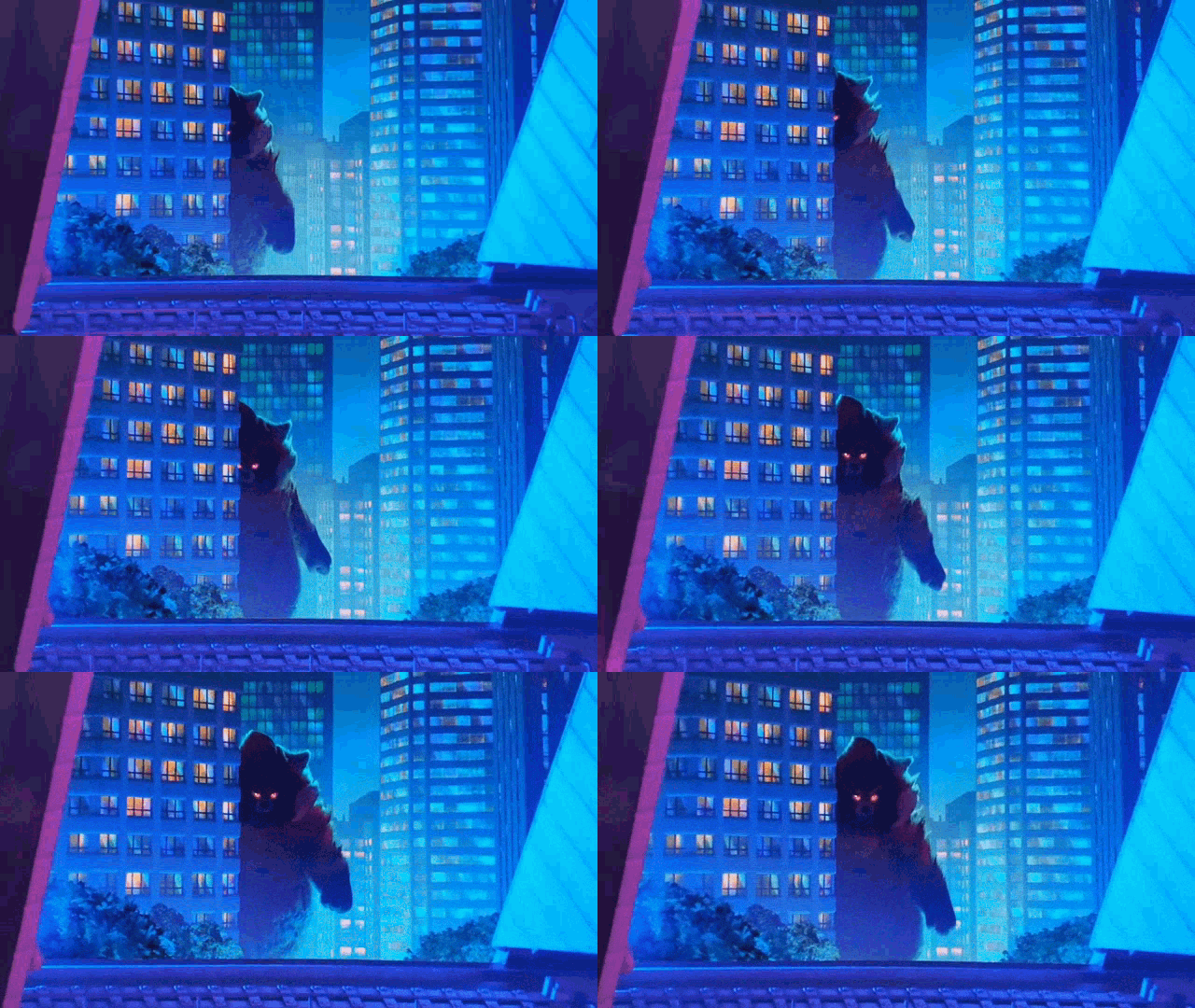
The most fascinating piece of information about hair, or in this case, fur, belongs to Ming Panda. Spoiler Alert: At the end of the film, Mei Lin’s mother becomes a giant Godzilla-sized panda herself. Again playing with the subtle emotion idea, simulation artists incorporated tools into the fur so that it moves like fire. You know, like the rage burning inside Ming? Interestingly, when animated at 24 frames per second, it looked TOO MUCH like fire, so the team went in and slowed just that process down to 300 frames per second. You can notice this in its greatest effect during the concert scene, and now, I can’t unsee it.
Jacob Brooks, who led the simulation team also jokingly made a challenge while discussing the movie, saying “I challenge you to find another (computer animated) movie where there is more hugging than in this one." I actually might try. You can watch all the hugging and look for these little details in Turning Red, now streaming on Disney+.

