LightBox Expo Recap: “Marvel Studios Visual Development” with Ryan Meinerding, Jackson Sze, Andy Park, Jana Schirmer, Rodney Fuentebella, and Ian Joyner
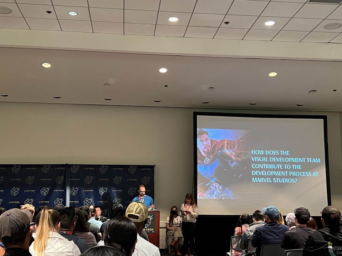
When you see one of Marvel Studios’ big blockbuster films or hit streaming shows, it’s not hard to see that a lot of craftsmanship goes into each production. Personally, I think about the acting, the visual effects, the costume design, hair and makeup, and cinematography. But the unsung heroes are truly the visual development artists, who really lay the groundwork for all of the other jobs that are required to bring each project to life. Among the many amazing opportunities afforded to LightBox Expo attendees this year was the chance to hear from seven of these artists during a panel called “Marvel Studios Visual Development."
Ryan Meinerding has been with Marvel Studios since its inception, starting as a character designer. Adapting the work of comics artists on the first Iron Man film, he showcased how a script suggestion (“Tony Stark tries on his Iron Man boots") was interpreted as a piece of art and how closely the final frame of film matched what he visualized. In addition to designing the characters, visual development artists also design the hero props before they get fabricated, create keyframes to help filmmakers see the final look before filming begins, and pitch ideas. Occasionally, their work even ends up on screen, which was the case for some World War II posters Ryan designed for Captain America: The First Avenger and the Smithsonian mural seen in Captain America: The Winter Soldier. Ryan shared one of his biggest challenges from Phase 1 - visualizing the moment when Iron Man, Hulk, Captain America, and Thor would come together on screen alongside Black Widow and Hawkeye in The Avengers, showcasing the art piece that became the iconic spinning shot of all the heroes back-to-back in a circle on a bridge. And in a blink-and-you’ll-miss-it moment, he showcased 150 varying designs that were done for Spider-Man’s first appearance in the MCU in Captain America: Civil War.
If you think that less work goes into creating a streaming series than a motion picture, you’re wrong. Visual Development Supervisor Jackson Sze took over the presentation to illustrate how the same amount of care and detail went into the design of Shang-Chi as it did for She-Hulk. Even non-human characters, like Rocket Racoon from Guardians of the Galaxy or Taweret from Moon Knight, go through the same amount of revisions until the final look is decided on. The same is true of props, with development artwork of the Ten Rings juxtaposed against designs for Ms. Marvel’s bangels.
Although Marvel Studios has one cohesive group of visual development artists, their approach is constantly changing because each project comes with a different director. Andy Park, Director of Visual Development, used Thor: The Dark World as an example, showcasing how much the tone of that film changed with director Alan Taylor. Andy was an artist on that film, but was a supervisor by the time Guardians of the Galaxy, Vol. 2 came around. He shared that one of the most challenging characters to design was Ego, the living planet. It took the team about five months to settle on a design for the character, played by Disney Legend Kurt Russell. Some early ideas included designs that made him a space pirate. As hard as it was to settle on a look for Ego, Andy’s first pass at visualizing Mantis was instantly approved by James Gunn, a rarity, although the design was modified for the practicalities of makeup and prosthetics. Sometimes an established character is quickly done for a new film, as was the case with Jane Foster’s Mighty Thor look from Thor: Love and Thunder, whereas transforming Wanda Maximoff into her true Scarlet Witch form in WandaVision took a lot of designs to get right, with a goal to be both connected to the comics and rooted in the realities of the MCU. On average, any character’s design seen on screen took about two months of work for a visual development artist.
With LightBox Expo catering to emerging artists, the question of how you become a visual development artist was answered by illustrator Jana Schirmer, who had anything but a conventional path. As a self-taught artist, her style was primarily rooted in Japanese anime and manga, although she enjoyed painting realistically. She had worked for another studio prior to Marvel and had a bad experience, so she almost didn’t apply when an illustrator position opened up. She decided to submit her portfolio, which she said consisted primarily of illustrations and portraits, but not a lot of design work. Still, it was enough for Ryan to see that she had potential and he gave her an assignment to create the likeness of an actor and design a costume, which got her the job. Showcasing some of her work, she shared an image she created for She-Hulk: Attorney at Law of Jennifer Walters in a group hug with Abomination and Hulk, which she joked is “The most expensive hug in TV history" due to all of the visual effects required.
Rodney Fuentebella showcased just how much a character’s look, costume, and props can change during the design process, rapidly scrolling through variations of Killmonger from Black Panther and options for his weapons. One repeated tip I kept hearing throughout LightBox Expo was the importance of being able to do a quick sketch. In this case, Rodney showed how quick sketches of Spider-Man helped him communicate his ideas without wasting too much time. With the go-ahead, he then began to produce more detailed development pieces. He also talked about tools of the trade, with CG sculpting becoming a useful tool for scale. He showcased a hillside battle he visualized for Moon Knight and the layering required to build each character in 3D, pose them for the art, and then paint over that. He also used 3D sculpting when designing the Spider-Bots for WEB SLINGERS: A Spider-Man Adventure for Avengers Campus at Disney California Adventure, joking that he got tired of drawing all those legs.
Ian Joyner showcased how the team collaborates, explaining that his specialty is creatures. Rodney created the DNA of the deviants in Eternals, with materials referred to by their visual texture (“beer" and “champagne"). Those components were then used to create all of the forms that these creatures take. Ian also had a full-circle moment on Spider-Man: No Way Home, having worked on the character Lizard in his first appearance in The Amazing Spider-Man when he was working for Stan Winston Studios. Reunited with the character, Ian got to push the designs even further on his most recent appearance. Ian also discussed leadership, having been promoted to a Visual Development Supervisor on Doctor Strange in the Multiverse of Madness. Proud moments from that project were helping a team design the musical battle, America Chavez’s star-shaped portals, and bringing undead characters to life in live-action following the Zombies episode of What If…?
Wrapping up with a Q&A session, Ryan Meinerding summed up what a visual development artist’s job really is - to inspire others. You can’t do that unless you’re inspired yourself. As a diehard Marvel fan, he surrounds himself with sources of inspiration from the talented artists who helped create and evolve these heroic characters over the decades preceding their MCU debut. But with so many artists on the team, they all have developed their own tricks for finding sources of inspiration, which often involves stepping away from screens and books and getting out into the real world.
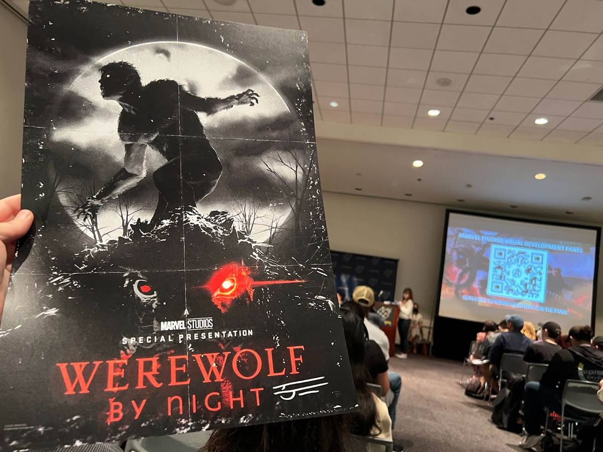
Attendees walked away with a cool Werewolf by Night poster designed by Ian Joyner, signed by the artist. Stay tuned to Laughing Place for all your Marvel news. Visit LightBoxExpo.com to learn more about the annual event held in Pasadena and how you can attend next year.


