Interview: Disney Lorcana Artist Nicholas Kole
This weekend, after months of hype, Disney Lorcana from Ravensburger premiered at Gen Con 2023 in Indianapolis, Indiana. As I noted in my recap of the first tournament for the game, enthusiasm for Lorcana has been palpable as fans wait in often long lines to purchase the game and have a chance to play it for themselves. Meanwhile, I’m admittedly more interested in the collecting side of things as the art of Disney Lorcana is unique and, dare I say, quite awesome.

Right: Nicholas Kole (Kyle's shirt was provided by RSVLTS.)
That’s why I was excited to have the chance to interview artist Nicholas Kole whose work is not only featured on several of the Disney Lorcana cards but has also been used in several of the promotional materials so far. Today, I had the chance to sit in a suite at Lucas Oil Stadium(!) and chat with Kole about creating some of the amazing art for the game.
Kyle Burbank: So first, congratulations. Disney Lorcana has been the talk of the convention as everyone's very excited to have it and play it. My first question is just how does that feel for you now that the game is in people's hands and they can actually look at these cards more in depth instead of just seeing them online and how's it been with the reception?
Nicholas Kole: Yeah, extremely surreal. I think that the main emotion I've been feeling over the course of the last couple of days has just been gratitude to be a part of this moment for people. I didn't realize it would be a moment to the extent that it is. And it's really exciting to look around and see the line and see the enthusiasm, meet the people coming up to the signings, especially those who are bringing their kids. And that's so gratifying to see kids hovering and waiting for the signature and being like, "That's my card."
And yeah, that's just enormously satisfying as an artist in this space. It's easy to feel isolated doing this in your room, working from home, drawing on an iPad, it's an abstraction. It's further away from you. And being here among people wearing, in some cases cosplay for this game that just launched today, is really surprising and exciting. And like I said, I just feel really grateful.
KB: One of the things I love about the art of Disney Lorcana is that, in some cases, the characters that we see depicted feel very familiar while, other times, it's completely different versions or elements that we haven't seen before that feel completely new. How did you approach each one of those and which was your favorite? Did you like to stick to the traditional look or do you like to play more and do some of the crazier ones?
NK: There's something really great about both. I am also a huge Disney fan from way back and I'm a musical theater kid, so every time I get a card brief, it's just songs are in my head and I start to rewatch the movie and I get excited about it all over again. So there's nothing about doing the straightforward take that isn't great, but there is something very exciting, especially as a character designer, to get to put your own spin on one of these characters. And honestly, a little intimidating too, because there's people with so much passion for the characters and love for the history, and I share that as well. So I want to make sure I do right by the fans and myself and my wife. And we're excited to try and preserve what we love about the character while inventing in the spaces visually and narratively around them where people are excited for new things and not to take away from the things that they love.
KB: So you mentioned a card brief. I'm imagining that you get a writeup of, "We are looking for a card to do this power," and then you execute on that. Is that correct?
NK: Yeah, definitely. Although in most cases, those briefs come already with the character, the color of the set and in most cases, but not all, some idea of narratively where the character is and what sort of moment they're having in the illustration.
KB: So then were there any instances where you end up drawing something for this and they're like, "Oh, actually you added something that we didn't necessarily think of," but influenced the power set the finished card had?
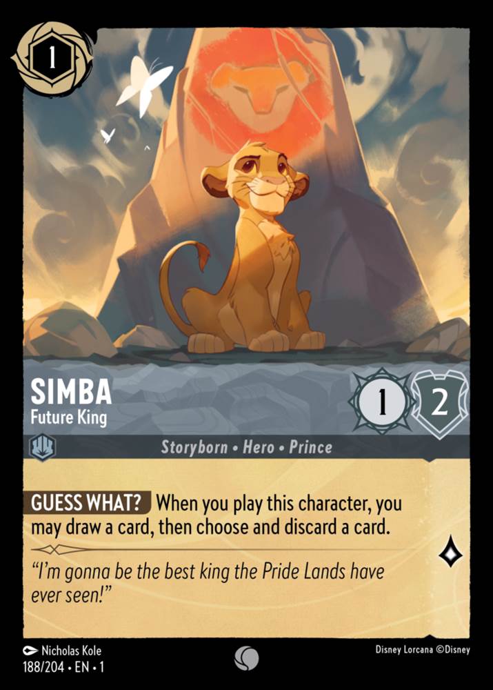
NK: Yeah, I think so. I don't know about power set influence, but definitely we discover surprises visually along the way. And I know for a fact that the [Future King card] specifically was really fun narratively to explore, how do we depict Simba as a cub, but also imply what he's going to become? And so I pitched the idea of digging into the paint image that Rafiki creates on the tree, but we created a monolith that's a little bit reminiscent of Pride Rock to enforce the fact that he's steel themed from that subset of the cards and combine that. So he's standing against the large main version of himself that Rafiki draws in the tree.
I obviously tried to really get the look so that immediately when you see that it's not like, "Oh, Nicholas did a weird chalk drawing." It's like, "Oh, that's the drawing from the movie and I recognize it immediately." And as we were doing that, we realized it would be best if there was something distracting Simba that's simple. So a butterfly came into the composition so that while the framing could be very imposing and very iconic in that way, he's a little distracted off to the side, which speaks to his personality.
KB: That was something I didn't even think of until now, but what medium or media did you use when doing the art for these?
NK: Oh yeah. In the case of most of these, they start in my sketchbook. So they start just like ballpoint pen or in some cases very loose blunted pencil. Anything that I start the process with should be pretty cheap, pretty imprecise, because I don't want to get attached too soon. So we're just trying out different compositions really quick. Usually that's just for me, but by the time it gets in front of Ravensburger and then Disney for approvals, we've tightened that up and that's digitally. So I work in Procreate on the iPad primarily for what I do.
KB: Cool. And then obviously you're working with Disney and they need to approve everything. Did you feel like you had pretty free reign or do they have some tiny notes of maybe character things that you might not have thought of that they have to point out and be like, "Actually..."
NK: I was joking with somebody the other day about, "Did you know that Ursula has a mole?" I didn't, but now I do. I sure do because it's usually those little continuity things and trying to really retain the on model look of the characters. And that speaks to that first question you asked where we want to innovate but not take away from what makes the characters great and beloved in people's hearts and minds. And so it's hard to thread that needle sometimes.
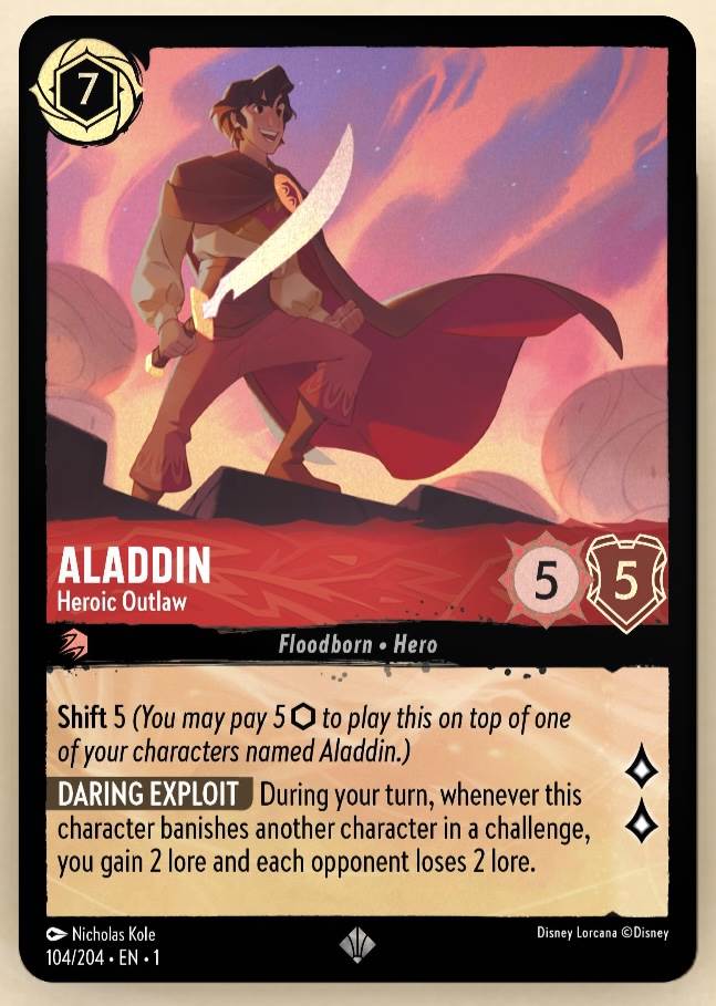
With Aladdin, he doesn't have his iconic hat in the card illustration and his outfit changed. And so trying to make sure that that character looks as much like Aladdin in all the other ways as possible so that when people see him, they don't see some other floppy haired dude, but in fact recognize him as Aladdin no matter how much we've changed about the design. Pretty important. And those are the notes we usually get back from Disney. "Hey, this looks great, but not getting Aladdin yet." There's a couple of things about the nose or the eyes, and we'll take a look actually often at the original model sheets from the movies to try and make sure we're in line with what's going on there.
KB: Another thing that's really cool about these cards is that each card has a foil version that people can find in the booster packs or some in the starter decks. At what point do you start thinking about that and how you're going to incorporate the foil into your design?
NK: Honestly, very little. Now I will, having seen the actual physical cards, I'll be giving a lot more thought to that. It primarily comes into the structure of the files we're handing over. The team wants as many layers as possible, but in some cases it's desirable for the artist to work in as few layers as possible to get a particular look or feel.
But you want to give the team down the line who are making those decisions about foiling, the opportunities to say, "You know what? Actually I think this door frame in the background or this particular sparkle of magic or whatever should be what's elevated." And keeping it layered for them makes that an easy decision. In some cases I've definitely made the team work a lot harder to do that.
KB: Yeah, I think there's Aladdin one with the sword is shiny.
NK: Yeah, well that one was easy because Aladdin's sword in some illustrations and moments on the card packs, it's just too large a shape to fit with the other characters on the pack itself. So the sword was handled as a separate element completely so that in some posters he has a sword and some posters, he just has a fist. And the challenge there was trying to make sure that the fist felt heroic and natural in the pose without the sword, so that suddenly when a sword appears, it also still feels like, yeah, that's reasonable.
KB: I'm going to have to look for that now. And then of course I'd be remiss if I didn't ask what your favorite card of everything in the First Chapter that has been released? Either ones that you've done or if there's another one that one of the other artists did.
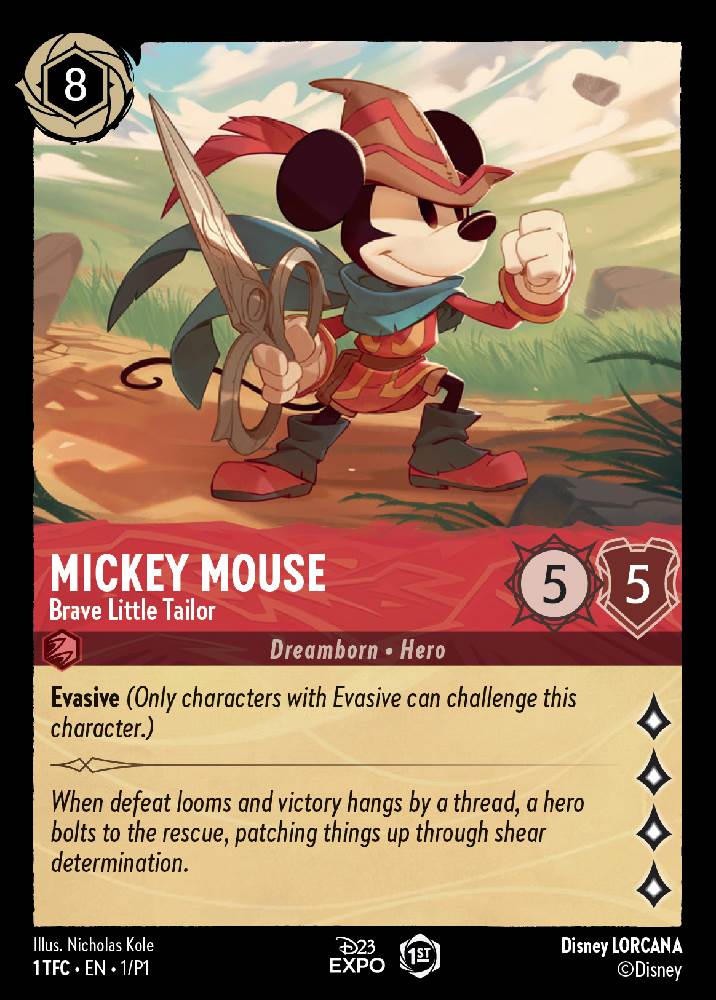
NK: I have three answers to that. The one that's blowing my mind the most is “Brave Little Tailor Mickey" and seeing that card circulate as part of the original D23 set and come back around in the hands of fans for signings today. That's really cool. Sometimes with the whole team's signatures on it. Obviously it's Mickey, so he's so iconic. I remember feeling very intimidated getting the brief to actually do a version of Mickey like that, but I think it came out really well and I'm excited about that and being a part of the history of the game that way.
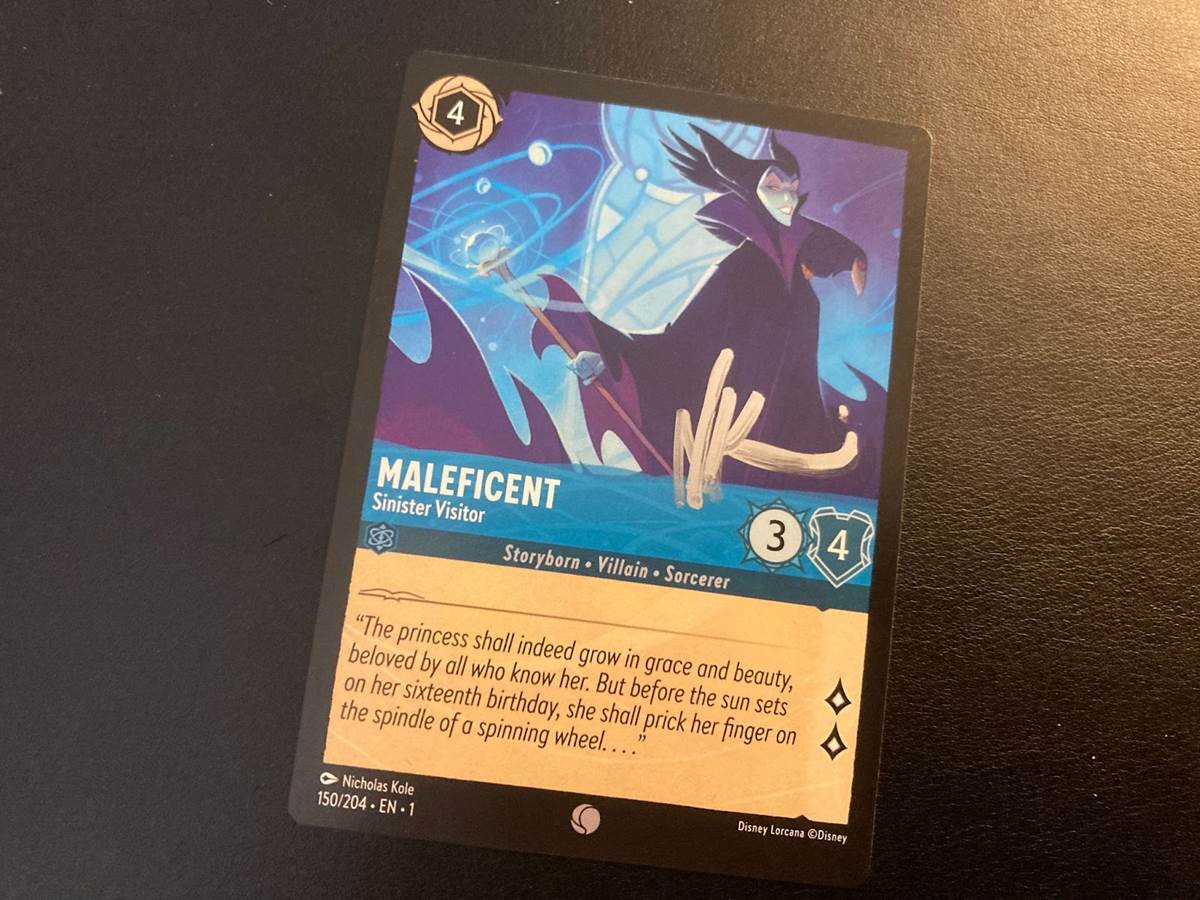
I have a real soft spot for Maleficent because my history with Disney started in around 2014 when I did a book called The Curse of Maleficent, which came out with the Angelina Jolie movie and I did the cover and all the interior illustrations. And so getting to come back ten-ish years later and revisit the character was really cool.
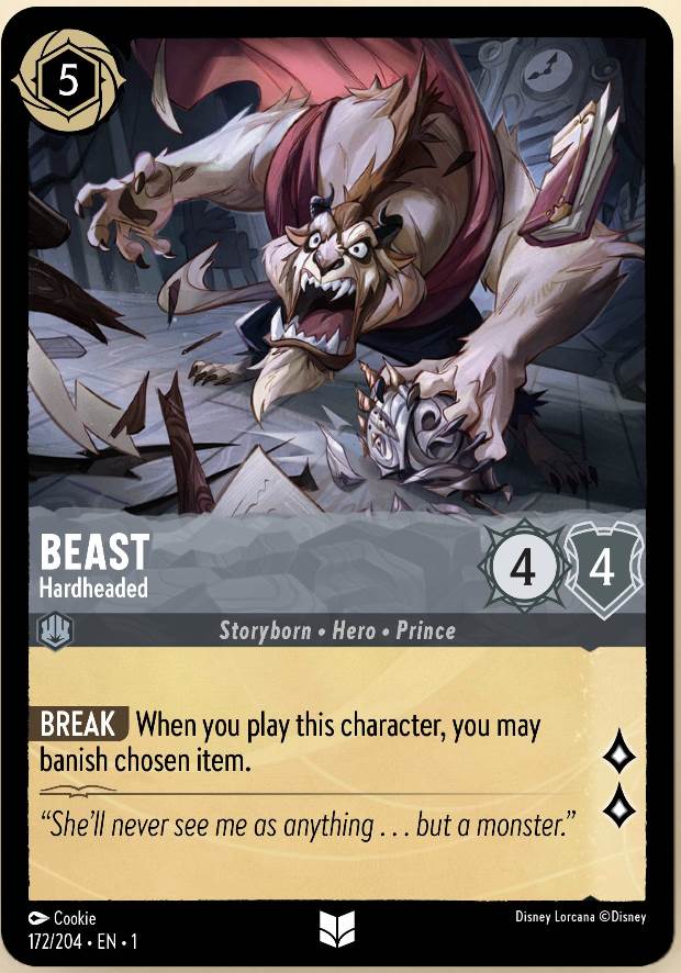
And then in terms of other artist cards that are in the set, Cookie did a Beast card for the steel set that's incredible. It's so good. The dynamism, the foreshortening, just the solidity of the drawing. And it really still feels on model, but he's pushed it in a way that's really exciting. I think that card's killer.
Disney Lorcana made its official debut at Gen Con Indianapolis this weekend but will be available in local game stores and at Disney Parks starting August 18th followed by a wider release on September 1st, including shopDisney.
(Please note this article contains affiliate links. Your purchase will support LaughingPlace by providing us a small commission, but will not affect your pricing or user experience. Thank you.)


