Disney Lorcana: Exploring the Art and Design of a Magical Trading Card Game
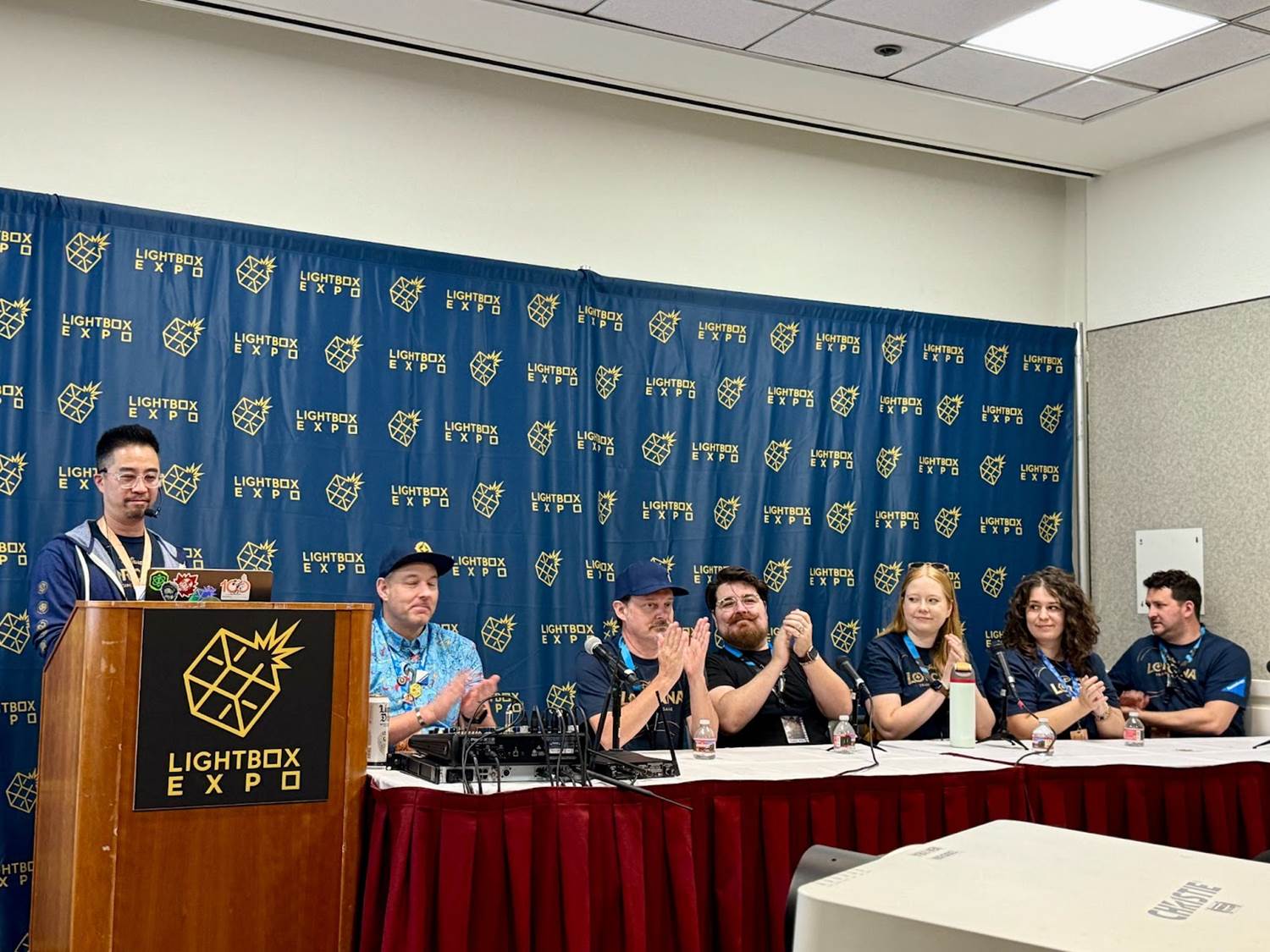
The recent LightBox Expo panel for Disney Lorcana offered a deep dive into the innovative design behind this trading card game from Ravensburger, blending elements of Disney lore with a visually stunning and thoughtfully structured aesthetic. Hosted by Lead Art Director Matthew Eng, the panel featured insights from the creative minds behind Lorcana, including Creative Director Shane Hartley, Worldbuilding Art Director Erik Van Horn, and several talented illustrators who contribute to the look and feel of the cards. They discussed everything from the game’s visual language and art style to the process of designing character cards.
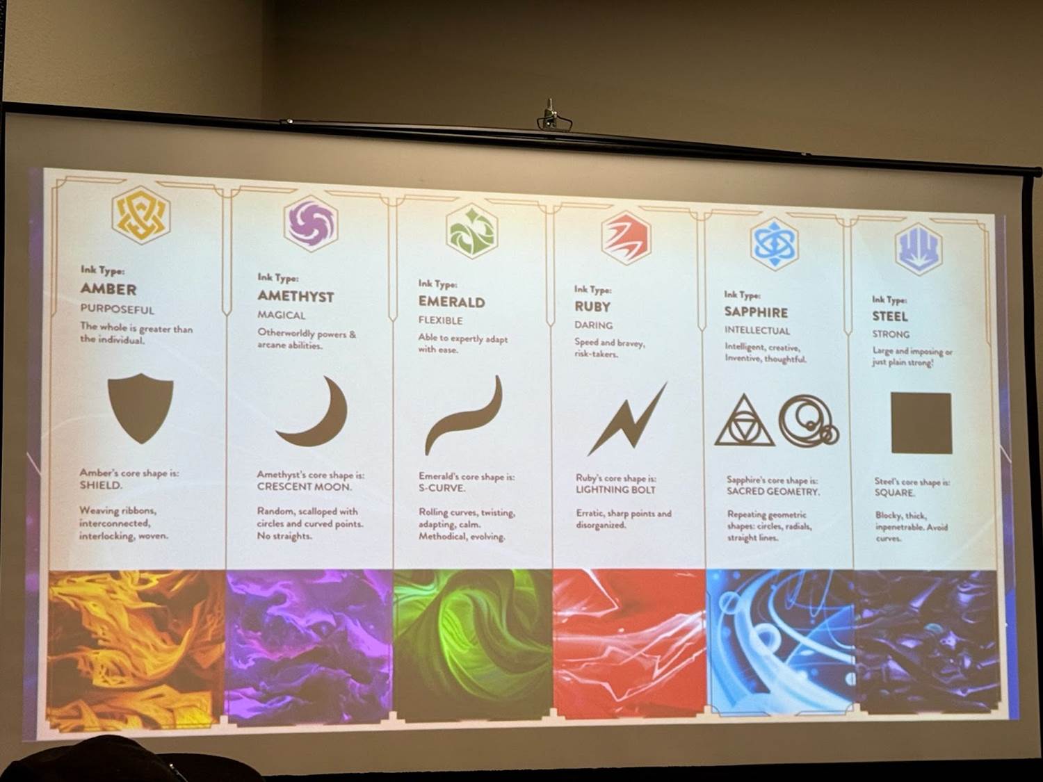
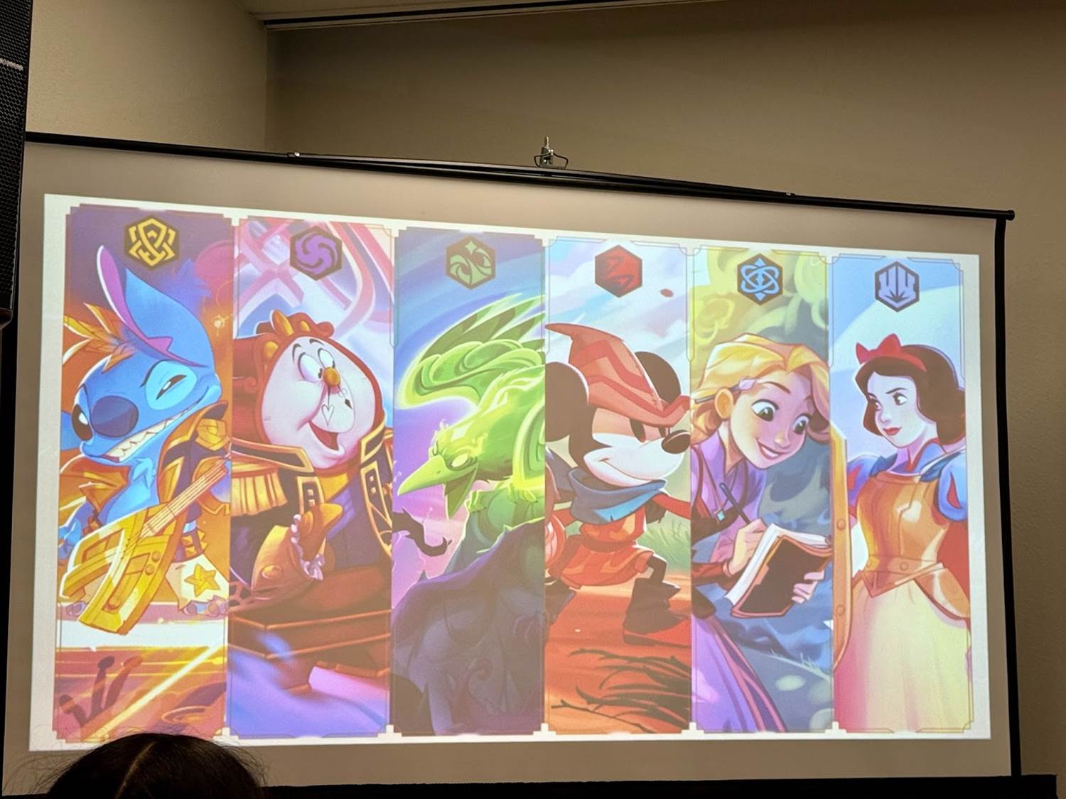
Erik Van Horn described Lorcana as a “magical realm where every story ever told still exists," represented as “story stars" that float in a vast nebula. These stars house characters, places, and items from beloved Disney tales, which players (aka Illumineers) can bring to life as glimmers. The Great Illuminary, a massive, mystical library, serves as the central location in Lorcana, preserving and connecting Disney’s timeless stories. Within Lorcana’s world, players harness six magical inks, each with distinct characteristics that influence the look and personality of the cards:
- Amber: Purposeful, focused on leadership and teamwork, represented by weaving and interlocking lines.
- Amethyst: Magical, with crescent and moon motifs symbolizing mystery and supernatural qualities.
- Emerald: Flexible and mischievous, characterized by S-curves and fluid forms.
- Ruby: Daring and action-oriented, with angular, jagged shapes suggesting bravery.
- Sapphire: Intellectual, emphasizing logic and structure through sacred geometry.
- Steel: Strong and immovable, represented by square shapes for stability and resilience.
Each ink type influences characters’ personalities and visual elements, like costumes and backgrounds, to unify the world and immerse players in its magic.
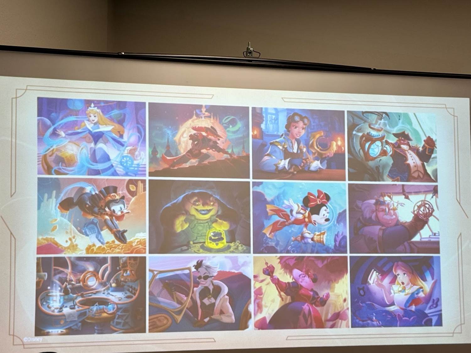
Shane Hartley explained that the visual style for Lorcana is rooted in “magepunk," a blend of mystical and scientific themes inspired by Merlin’s magic and Leonardo da Vinci’s inventiveness. This influence creates a world where magic has its own science, illustrated through recurring design themes. Art Deco and Art Nouveau elements were key in developing Lorcana’s style, giving the game both structure and fluidity.
Art Deco’s bold, geometric patterns and Art Nouveau’s flowing, organic lines were integrated to create balance and visual interest. Throughout Lorcana’s cards, intricate gold, leather textures, and ley lines represent the flow of magical energy. These ley lines — subtle, flowing paths within costumes, backgrounds, and environments — visually connect the game’s characters and locations, giving players a sense that all elements of Lorcana are interwoven and alive.
Each illustrator on the panel shared their design approach, providing insight into how the aesthetic and personality of each ink type were applied to various characters.
Nicholas Kole on Mickey Mouse - Brave Little Tailor and Stitch - Rock Star
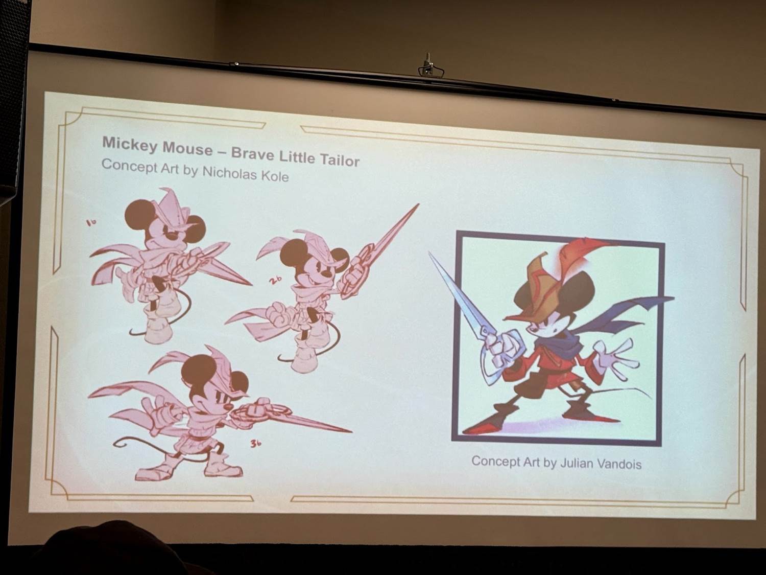
For Mickey Mouse - Brave Little Tailor (from The First Chapter), a card that helped establish the overall look of Lorcana, Nicholas Kole explained that working with an iconic character was both exciting and challenging. The design started with Ruby’s intense, angular shapes to amplify Mickey’s bravery and action-oriented personality. Julian Vandois’ initial sketch laid the groundwork, and Kole built on it with details like the engravings on Mickey’s scissors that follow the Ruby shape language and a subtle shadow of the giant’s hand across the ground to add depth. Small but significant adjustments, like adding pops of red, help make the Ruby ink shine through in a way that’s fresh but still true to Mickey’s classic look.
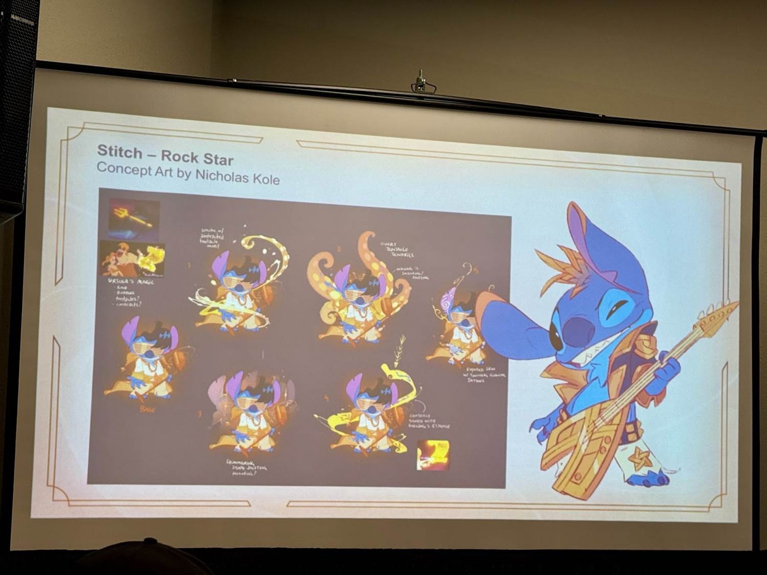
Kole’s Stitch - Rock Star card showcases Stitch’s rockstar energy while incorporating Amber’s group-focused, woven motifs. The artwork was originally intended for packaging, but eventually it was decided that this version of Stitch would be a prize card at Lorcana championship events. The pose and styling were developed to keep Stitch recognizable and dynamic. Elements from Stitch’s “rockstar" personality, like an Elvis-inspired look, were reinterpreted to fit Amber’s teamwork traits, with braided details in his costume and hair. For the Championship prize card, Kole added sparkly effects to heighten the magical feel, making it a fan-favorite in full foil.
Aubrey Archer on Rapunzel - Appreciative Artist and Snow White - Steadfast Heart
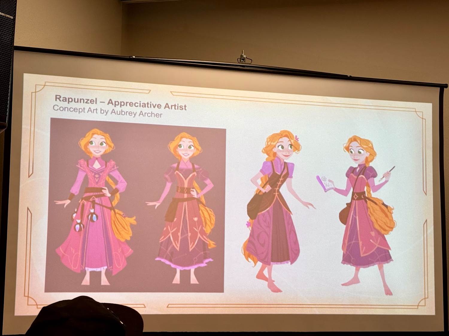
Aubrey Archer explored Sapphire’s intellectual and curious qualities in Rapunzel - Appreciative Artist (from Ursula’s Return). This design shows Rapunzel sketching in a magical forest, emphasizing her inquisitiveness. Sapphire’s shape language of repeating, geometric forms is present in Rapunzel’s dress and the forest’s succulents and flowers, giving her a structured yet organic look that mirrors her personality. Aubrey showcased the evolution of the concept during the event. A close composition captures Rapunzel’s focus on the natural world, while her long hair adds movement and frames the scene.
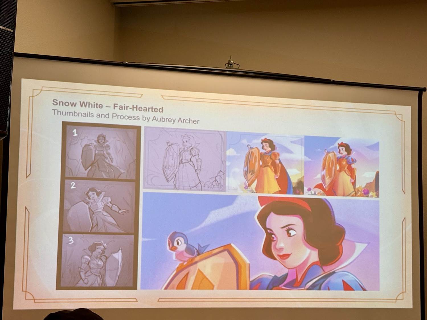
For Snow White - Steadfast Heart (from Shimmering Skies), Archer embraced Steel’s traits of strength and immovability. Here, Snow White is depicted as a protective yet gentle force, embodying resilience without harshness. The armor is styled with soft curves and floral motifs to retain Snow White’s nurturing nature while signaling her readiness to defend. In the background, blockier shapes maintain the Steel aesthetic, and richer colors replace a purely gray palette, making the card feel strong yet inviting.
Giulia Riva on Lumiere - Hotheaded Candleabra and Rafiki - Shaman Duelist
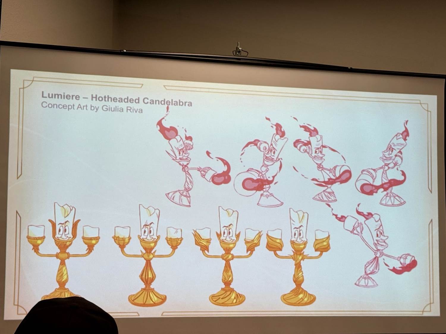
Giulia Riva’s Lumiere - Hotheaded Candleabra (from Rise of the Floodborn) card embraces Ruby’s fiery and daring energy. Lumiere’s usually rounded, elegant design was adapted with sharper elements in his costume and flames, giving him a bold, challenging stance. Riva described experimenting with costumes and poses to maintain his graceful essence while adding a touch of aggression, creating a Lumiere who’s not just charming but battle-ready. A small scar across his eye adds a hint of backstory, suggesting that he’s faced challenges head-on, which perfectly aligns with Ruby’s daring nature.
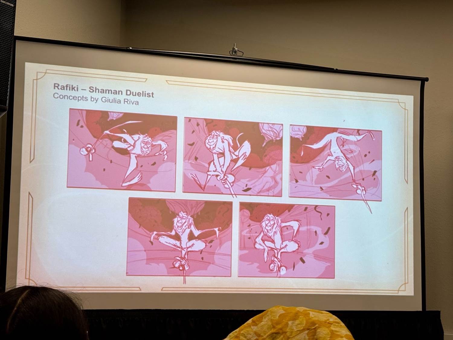
In Rafiki - Shaman Duelist (from Shimmering Skies), Riva explored Rafiki’s playful and mystical side, adapting him for an arena setting as part of the Shimmering Skies set. Since he’s an amethyst character here, the design uses amethyst’s crescent shapes in the background smoke and energy, giving Rafiki a mystical, action-driven aura. The scene’s colors and lines enhance the movement and energy, allowing Rafiki to stay true to his character while feeling immersed in Lorcana’s world.
Ron Baird on Flynn Rider - Confident Vagabond and Chip and Dale
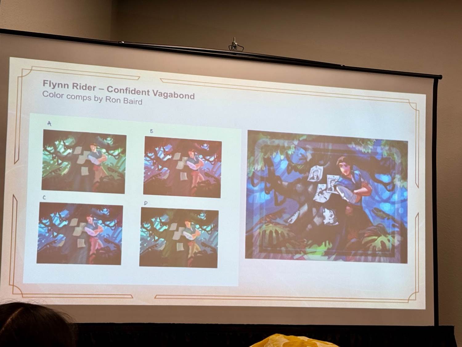
Ron Baird brought Flynn’s trickster qualities to life in Flynn Rider - Confident Vagabond (from Shimmering Skies). Originally conceived as a scene of Flynn avoiding guards in a tree, the final design shows him leaning nonchalantly against a tree, with Emerald’s flexible, S-curve shapes worked into the twisting vines and roots around him. Baird explained that he used photo references to nail the pose, aiming for a cool, laid-back vibe. The natural colors and subtle reds enhance the scene’s grounding, while wanted posters on the tree hint at Flynn’s backstory and previous adventures. Keen-eyed collectors may notice sketches of two previous Flynn Rider cards among the wanted posters.
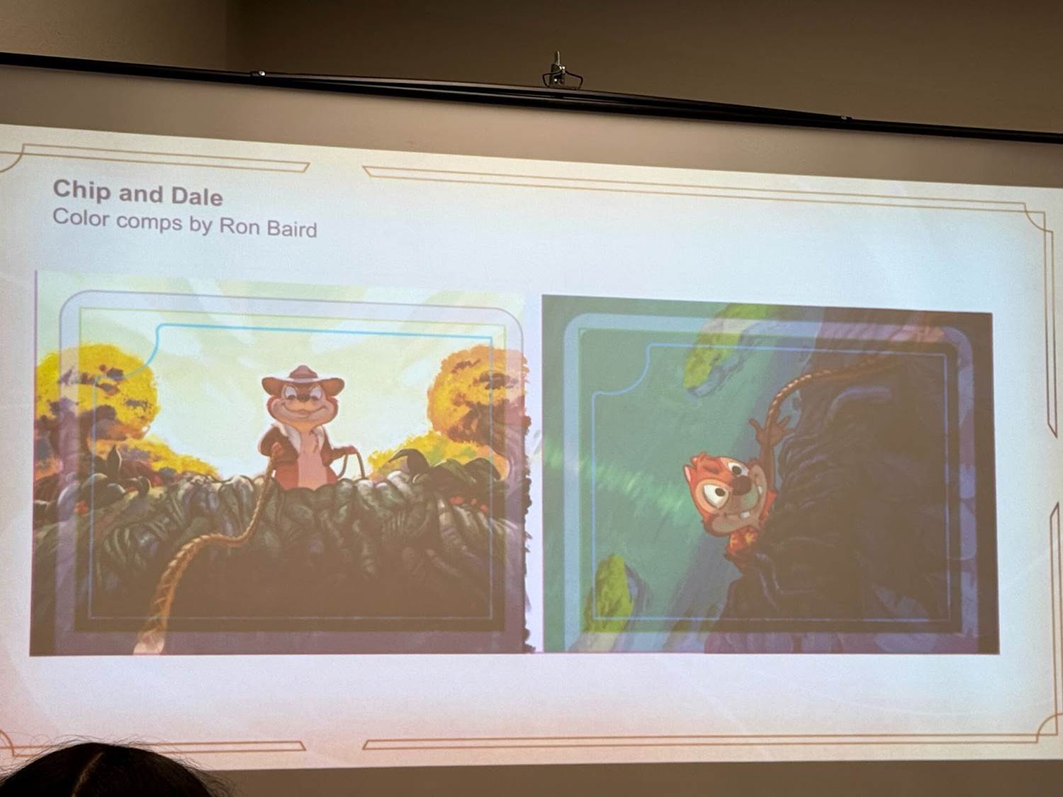
Baird’s Chip and Dale (from the upcoming set Azurite Sea) cards depict a narrative connection between the two, with Chip (A Friend Indeed) tossing a rope to rescue Dale (A Friend in Need) from a cliff. To capture the scene’s dramatic angle, he designed Chip with an upshot to look heroic and Dale with a downshot to appear vulnerable. Amber’s woven, braided shape language is applied to the rope and vines, giving the cards a unified, coordinated look. Baird used bold lighting and contrast, casting shadows over Dale to emphasize his predicament, while reinforcing the dynamic relationship between the two characters.
The Disney Lorcana panel at LightBox Expo showcased how Ravensburger’s creative team combines structure with imagination, creating a cohesive, immersive world that celebrates Disney characters in new ways. With the “magepunk" style, Art Deco and Art Nouveau influences, and distinct ink personalities, the game’s design invites players to dive into a world that feels both timeless and freshly innovative. The artists’ thoughtful approach to design rules and individual character details elevates Lorcana beyond just a trading card game — it’s a new way to experience Disney stories through the lens of magical, collaborative storytelling.
(Please note this article contains affiliate links. Your purchase will support LaughingPlace by providing us a small commission, but will not affect your pricing or user experience. Thank you.)


