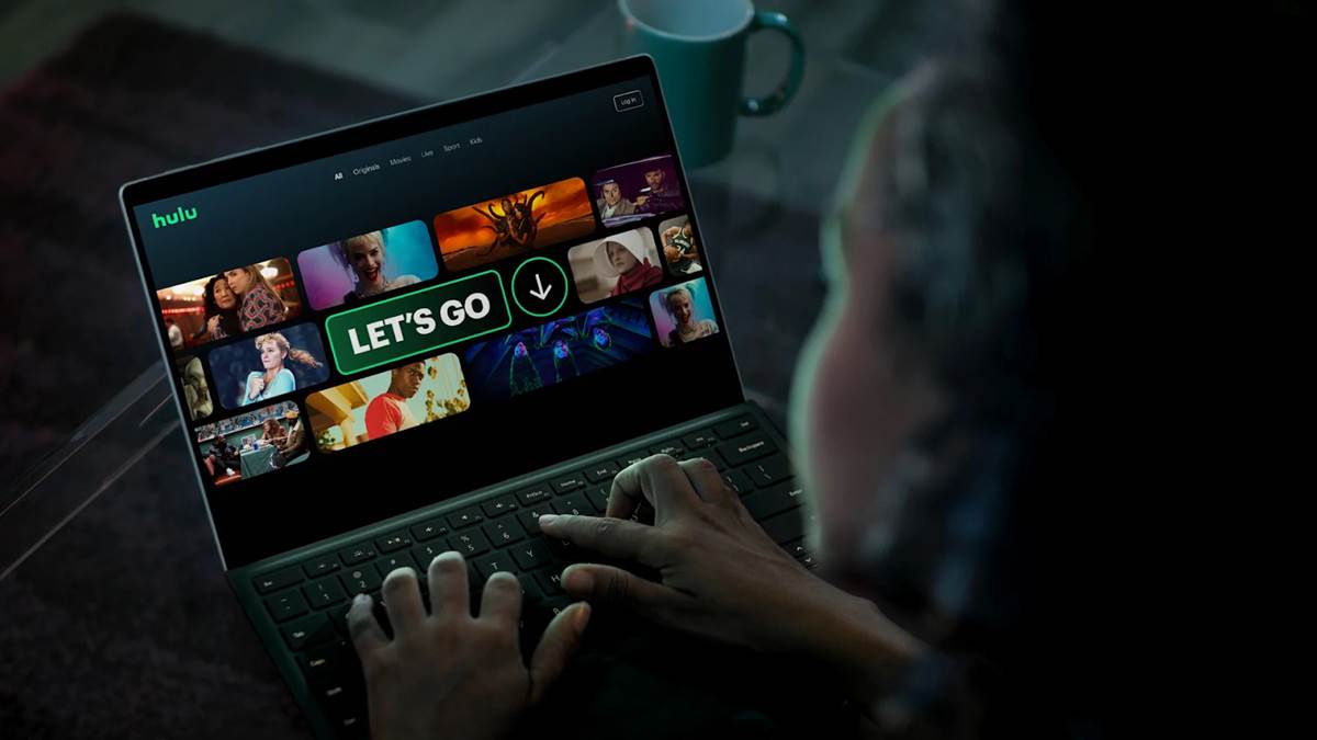
Hulu Unveils New User Interface, New Branding and New Ad Campaign
Hulu is about to debut a new look that changes the way subscribers interact with content while kickstarting a new ad campaign.

Hulu
What’s Happening:
- Hulu subscribers will see changes to the streaming service’s design implemented this week along with a new ad campaign, first reported by AdWeek.
- The new interface is inspired by the meaning of the word “Hulu,” which is Mandarin for “gourd” or “holder of precious things.”
- Image tiles will have rounded corners like the “U” in the streaming service’s name.
- Disney partnered with DixonBaxi, a London-based design firm, on the service’s new simplified design.
- The new design leans even further into Hulu’s green color scheme, a calming color that promotes relaxation and comfort along with the rounded tile corners.
- Along with the redesign, Hulu will debut a new sonic branding like the snap heard at the start of a Disney+ Original or the “Ba Bum” that starts a Netflix Original.
- Hulu’s signature sound will be a 4-beat mnemonic designed by sound design firm Zelig, which will provide an introduction to Hulu Originals and be heard in advertisements, including the new ad below that showcases the new interface.
- More robust advertising campaigns will also roll out soon in an effort to grow the streamer’s subscriber base (currently at 39.4 million) throughout the summer and fall TV season.
- Hulu is making a bid to become the most all-purpose streaming service on the market, with options to add live TV, sports and premium channels directly to the service.
What They’re Saying:
- Michael Schneider, Hulu’s vp of brand marketing: “With all the complexity and confusion of the market, it’s hard out there,” Schneider said. “I work in the business, and I don’t always know where to find a lot of content. Simplicity is our best friend in the space, and we definitely think we have the brand to be able to deliver that.”
Sign up for Disney+ or the Disney Streaming Bundle (Disney+, ESPN+, and ad-supported Hulu) now
