Today, the latest installment of the documentary short-form series One Day at Disney debuted today on Disney+ with the focus in this episode based on Gabriela Clark, who works in Marketing Creative Services for the Walt Disney Studios producing the marketing photo shoots for all of the live action films. While it may seem like an overnight process, the actual development of a poster for a film can take months or even years. We decided it would be fun to ask some members of the Laughing Place team and have them share some of their favorite movie posters from the Walt Disney Company.
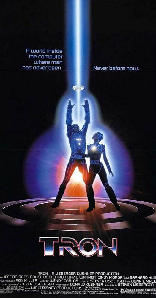
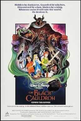
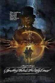
Jeremiah – Tron, The Black Cauldron, Something Wicked This Way Comes
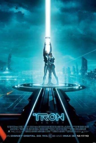
TRON – “That poster is very much a different take on the original Star Wars poster but the blue light and the costume drove me to the theater because we had no idea why this film was really going to be like.”
The Black Cauldron – “This poster was very much the same as most Disney animated features of the 70/80’s but the darkness of the Horned King looming over everyone really gave a very ominous feel to it. Sadly the poster is more memorable than the film ever will be.”
Something Wicked This Way Comes – “The teaser in the corner was enough of a hook for me to love this poster but having Mr. Dark with his hands open and a spark of magic with the boys running towards the carnival made me want to be first in line for this forgotten Disney Classic.”
While Gabriela Carter in the episode specifies that she works on the Live-action films, the creation of a film’s poster stretches beyond that genre and into other fields like Animation as well.
Tony – TRON: Legacy, Incredibles 2, Toy Story 4
TRON: Legacy – “If I’m thinking of Live Action, I’d say TRON: Legacy because it takes the original poster and recreates it with the two new characters from the grid, but also builds on it and shows the environment of the new Grid, and the little touches of being mostly blue with the Rinzler orange sneaking up in the lower corner.
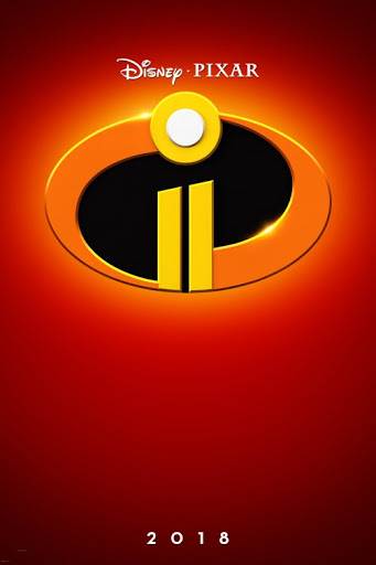
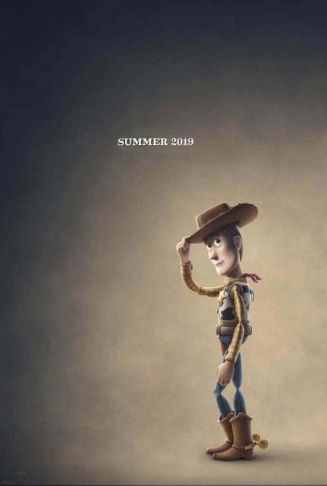
Incredibles 2/Toy Story 4 – “I love the simplicity of a teaser poster. There’s not a lot going on, but it’s enough to get someone excited and can even be subtle enough to hint at the plot of the movie with a single image. Incredibles 2’s poster was literally the logo for the Incredibles, slightly altered to make the lowercase ‘i’ into the stylized roman numeral ‘II’ and that was all that was needed to get me psyched for a movie I waited over a decade for. Toy story 4’s was equally as simple but far more telling. Woody in an almost faded more sepia tone tipping his hat as if to say goodbye, we (spoiler alert) were right to suspect that this was his curtain call.”
While Tony may have liked the simplicity of some of the posters, some of our team really enjoyed the large ensemble pieces that surely Gabriela Clark would spend copious amounts of time on.
Mike C. – Star Wars: The Empire Strikes Back
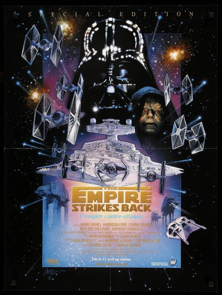
Our own Star Wars guru Mike C. pointed out something not many of us have noticed prior, not only noting his fondness for the composition, the colors, and the character choices, but that every vehicle featured on the poster is one belonging to the Imperial side. A subtle yet very telling addition.
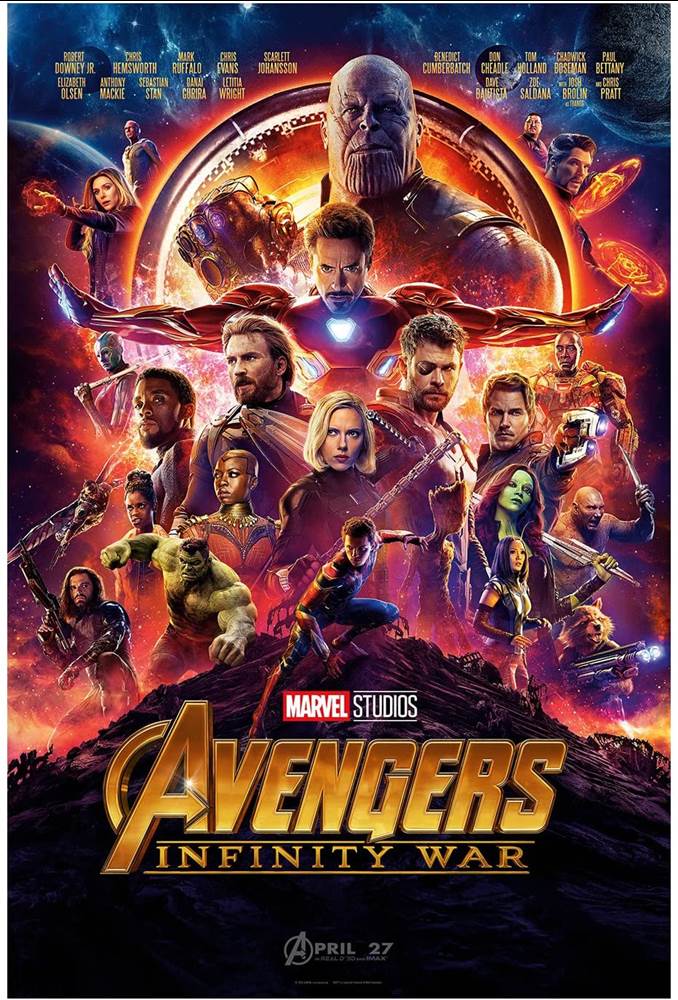
Mack – Avengers: Infinity War
“I think just because of the nature of the movie and how they managed to pull so many characters from different movies into it without it just looking messy… I think they did a good job with it.”
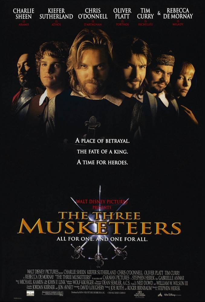
In this One Day at Disney entry, Gabriela Clark mentions how she spends time photographing talent for the posters, obviously referring to the actors and actresses who appear in the film, which could be the primary reason someone likes a poster so much. Rebekah proved this point with her pick.
Rebekah M. – The Three Musketeers
“What?!…I was in my early 20s!”
You can check out this week’s One Day at Disney short featuring Gabriela Clark, and even the films behind most of these posters available now on Disney+!

