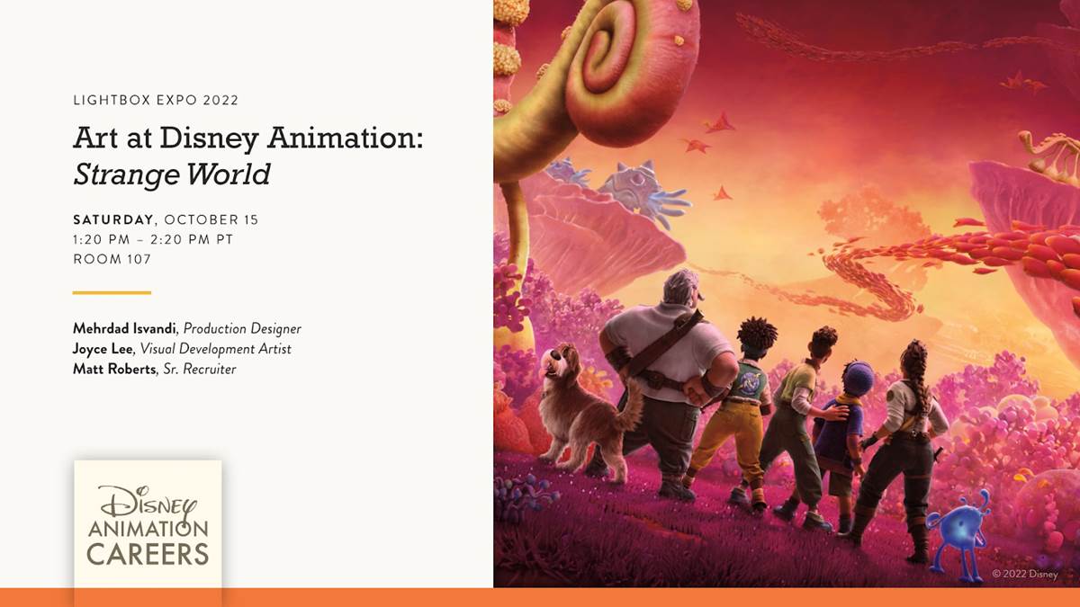
Walt Disney Animation Studios’ 61st animated feature Strange World hits theaters on November 23rd and LightBox Expo attendees got a closer look at the level of artistry required to bring an original world to life. Hosted by Production Designer Mehrdad Isvandi and Visual Development Artist Joyce Lee, here’s what I learned during the panel called “Art at Disney Animation: Strange World.”
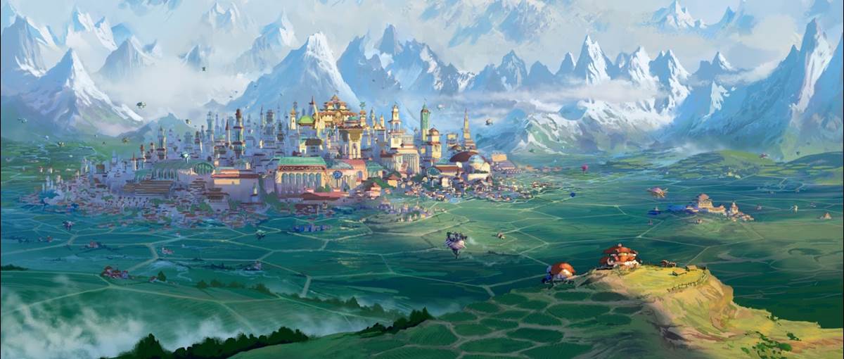
The characters originate in a world not too unlike our own in a city called Avalonia. To help differentiate it from your average terrestrial city, the family farm uses hexagonal shapes for not only the crop borders but even the family home. This area is filled with the warm colors of Earth, with green grass and plants, and blue skies. The film uses a chunky aesthetic for everything, with the interior of the farmhouse full of furniture that looks big and comfy. While the focus of the panel was on art and not the story, I think I saw some plot clues in the stained glass windows.
To bridge the gap between the mountain-locked world of Avalonia and the adventurous world beyond, the characters take off in an airship called Venture. Artist Cory Loftiss, who used to be a ship engineer, designed all of the vehicles in the film. Since the airship takes a lot of damage throughout the journey, the team had to create a total of 6 different skins for it, which became a continuity nightmare when rendering shots, making sure they had the right one for that moment of the story. We got to see an art progression of interior design for the ship, with smaller speeders for characters to use for both an emergency evacuation and as vehicles when they land. To help make the world feel more lived-in, the team was given direction to have one of these small vehicles be in repair in the set dressing. Similarly, a first pass at the engine room looked too new for the film’s equivalent of the Millennium Falcon, with touch-ups making the engine room look like it had been repaired with spare parts from other ships.
With a title like Strange World, the destinations of Venture’s travels needed to look unlike anything audiences have ever seen before. Disney is often able to borrow from a vast library of digital assets from previous films, but this project required nearly everything to be built from scratch. When you think about the world we live in, the dominant colors in nature are green and blue. Those colors were removed from the color scheme, and the team was challenged with creating a beautiful world out of hot colors. Microscopic photography of organic matter and undersea life served as sources of inspiration for a world that feels organic yet unfamiliar at the same time.
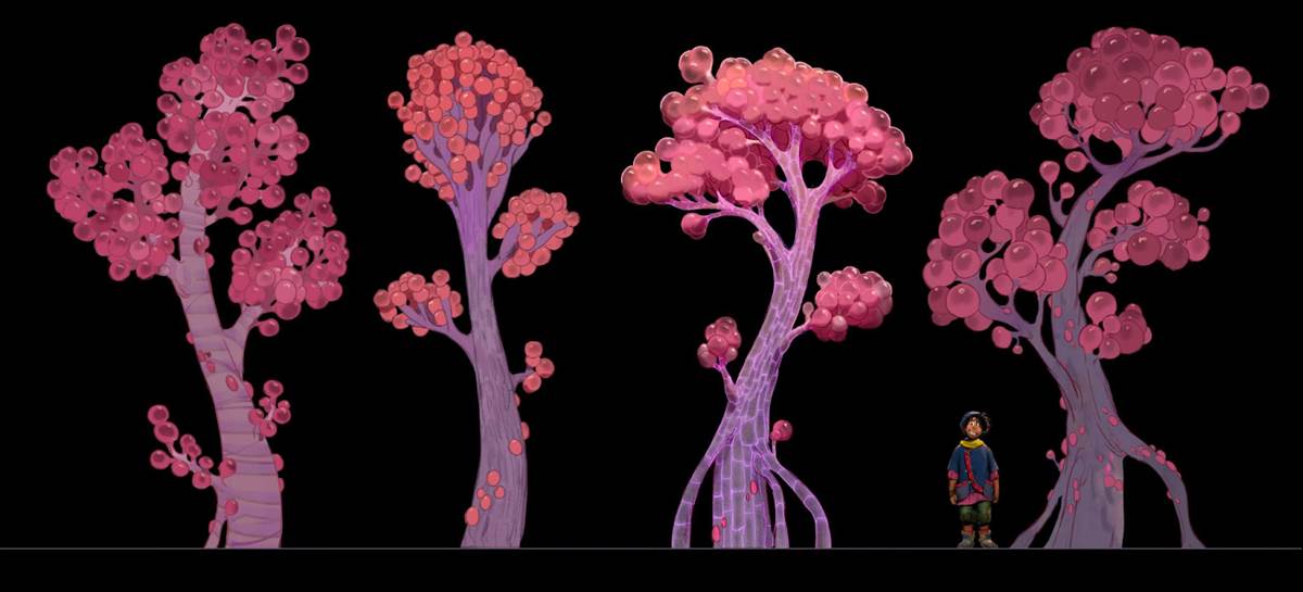
Exotic plants were given names, like Pop Trees. Joyce showcased some of the digital pieces that were created, with a variety of individual trees and groupings that could be placed and rearranged to create landscapes. These trees can calcify and merge together to become one massive tree, with their canopy even becoming terrain. Digital sets take up a lot of hard drive space and complicate rendering time, so the storyboards were imperative in determining how much of a set was needed for each scene. Mehrdad built an expanse of set in VR that would take about 2 hours to drive across to help the artists with eye lines and set construction.
A typical forest environment is easy to establish visually due to the obvious difference between trees, canopy, and ground cover. But with such a vivid world and trees that grow orbs instead of leaves, that became another unexpected challenge. The Look and Texture teams became a vital part of the solution. And as cool as the world was, there had to be a balance so that it wouldn’t distract too much from the characters. The world includes burping plants, all of which had to be moved around after shots were composed because they distracted too much from the main character action, which drives the story forward.
With Walt Disney Animation Studios always striving for top-quality storytelling with boundary-pushing visuals, Mehrdad shared that the studio gives them time to make every frame look as amazing as possible. Although the release is just around the corner, he shared that they were doing color correction on some sequences as recently as just four weeks ago. Character costumes feature unsaturated colors to help them stand out in such a vivid world, but we also got to see how a scene in the film was adjusted to make sure the characters moving across the exotic landscape caught your eye’s attention. Using layers of mist and fog, background details were softened in such a way that your eye is naturally drawn to the characters. As always, story still comes first at Disney.
The presentation ended with concept art for a final scene in the film, which depicted a beautiful city. Mehrdad Isvandi and Joyce Lee took the time to call out some of the artists whose work was featured in their presentation, which included Larry Wu, Kevin Nelson, April Liu, Ryan Lang, Justin Crown, and Paul Felix. While no photos were allowed, much of this artwork will likely get its moment in the spotlight with the upcoming The Art of Strange World book.
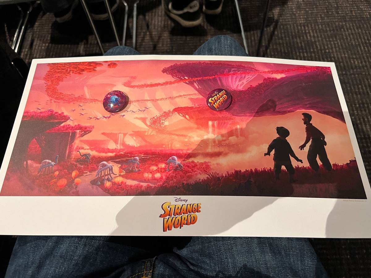
Attendees at the panel were given a lithograph and button set from Walt Disney Animation Studios. Visit LightBoxExpo.com to learn more about the annual event held in Pasadena and how you can attend next year. Strange World can be seen exclusively in theaters beginning March 23rd.
(Please note this article contains affiliate links. Your purchase will support LaughingPlace by providing us a small commission, but will not affect your pricing or user experience. Thank you.)


